
Happy WEDDING Paper
Ten years ago, I did a post on a darling, young, auspicious artist, and her “heraldry” and other artistic talents. I was obsessed and pinned every single image I could find. In fact, these custom emblems inspired me to start a wedding inspiration board on Pinterest. This board would be kept “secret” so as not to give away my original party planning ideas too soon. Since then, heraldry, aka custom emblems or crests, have become a common step in wedding planning. Is a wedding even a wedding without one?
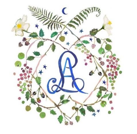
I adore the elaborate designs, but honestly, my favorite was this simple one.

I followed Happy Menocal through the years, and watched as her work became more and more popular. This kind of talent doesn’t go unnoticed and my secret find would not be hidden for long. Tastemakers like Mark D Sikes and Aerin Lauder were throwing parties where menus, featuring Happy’s artwork and calligraphy, could be seen perfectly placed in their stunning tablescapes. Happy was being sought out by the best in the business. I would continue to see her name for years, here and there, each time bringing a little thrill that I was lucky enough to discover her years before. I hoped I would someday have the opportunity to work with her.
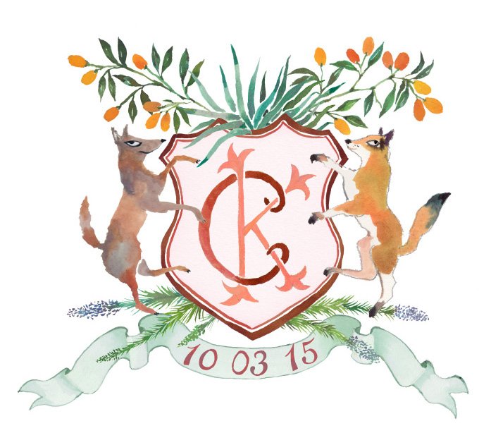
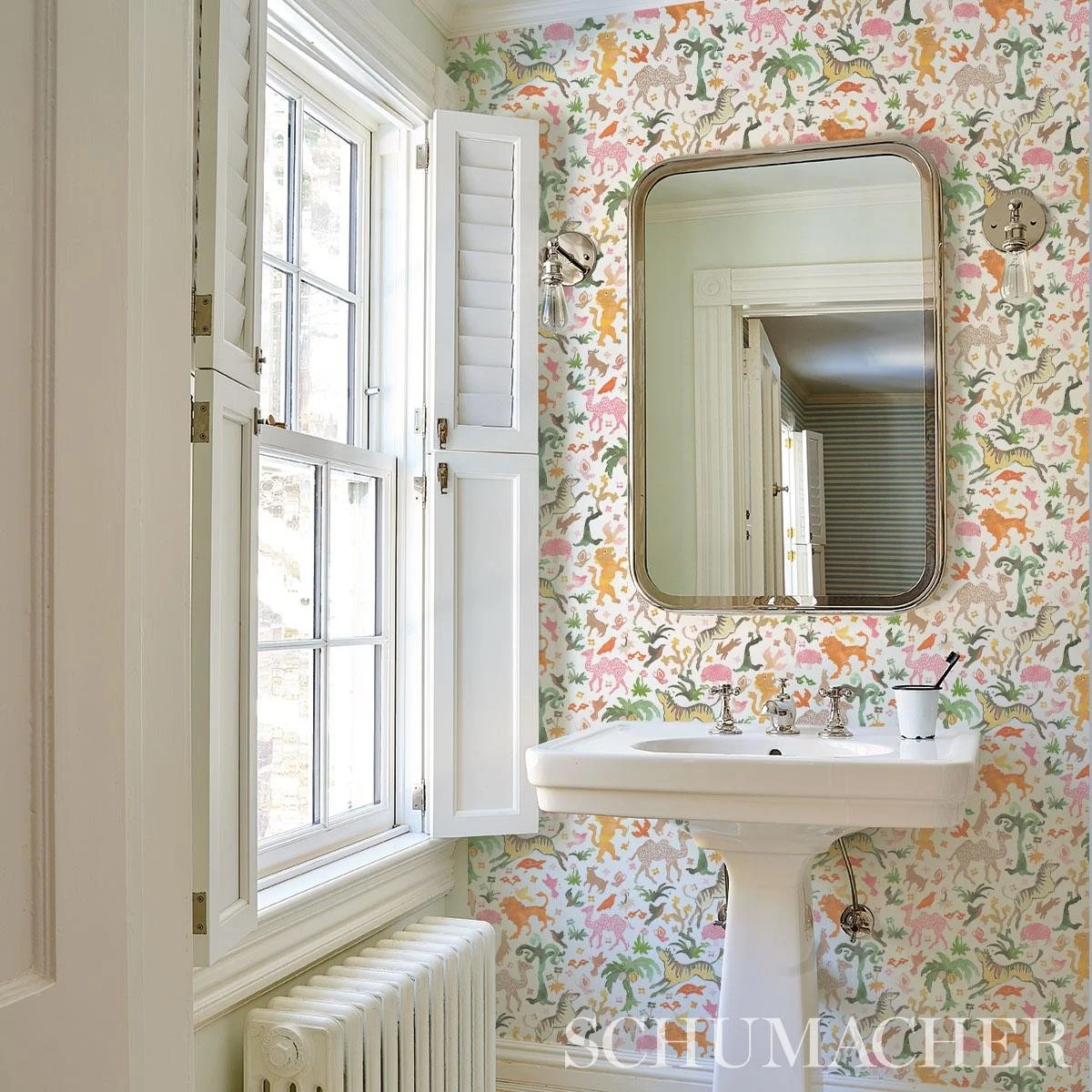
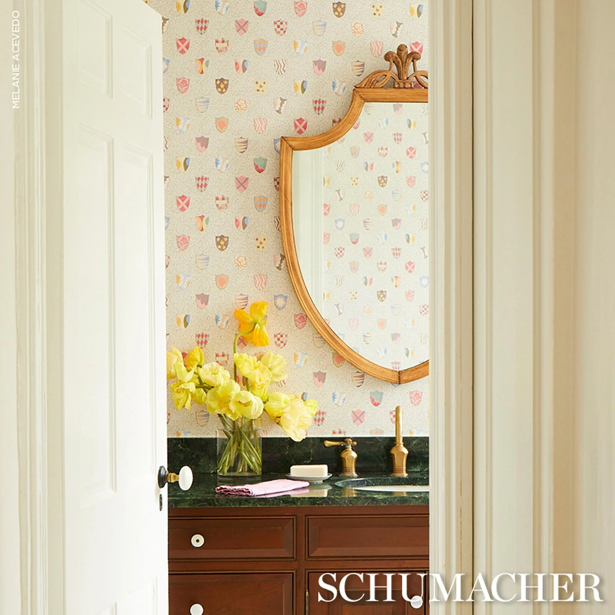
More recently, Happy has collaborated with big names like Schumacher:


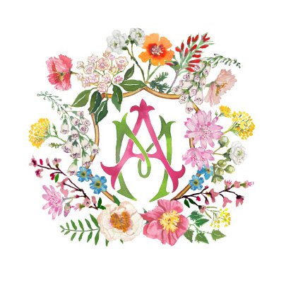
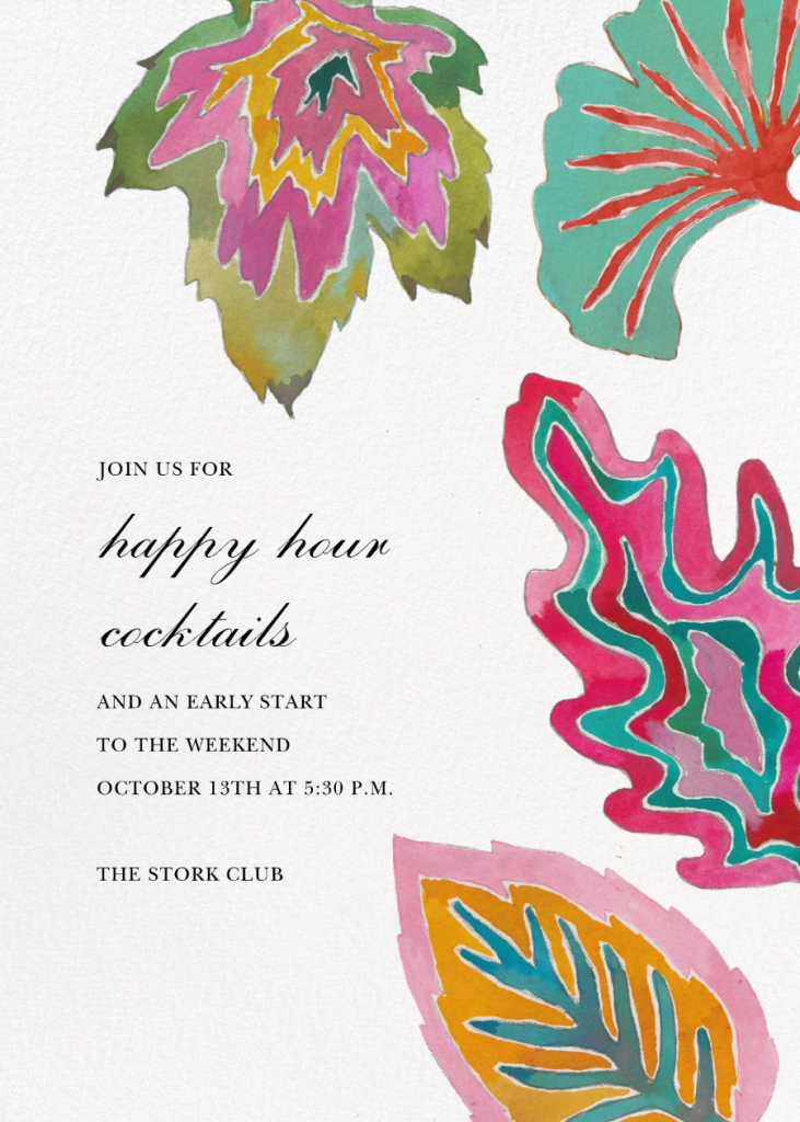
and Paperless Post:


And the list goes on and on. Her work has expanded to include a plethora of different mediums, and she remains in high demand, her name recognized among those who appreciate originality, quality, and talent of the highest degree. When Hillary and I were in New York last winter, wedding dress shopping, we ran across her artwork on the Home floor at Bergdorfs. Just give-her-a-google and you will find articles and videos galore including features in Over the Moon, Martha Stewart, Brides, Vogue, Forbes, and Town & Country, to name a few.
Working with Happy and her team (Hillary and Sarah) was probably my favorite part of wedding planning. The paper design often dictates the direction of other design decisions. There is a surprisingly significant number of paper pieces required these days for a wedding.
Every part of the process was fun. We started with inspiration photos and a questionnaire. I gathered photos on a Pinterest board, and as a blogger, I’ve been putting images together for inspiration purposes for a while, so this came naturally - I knew the drill. Hillary wasn’t as engaged with this process, but more interested in the approval stage. She knows that I know what she likes. Most everything I pick out, I would also choose for myself, but sometimes I lean toward edgy for Hillary.
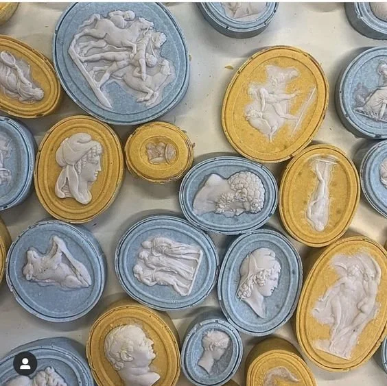
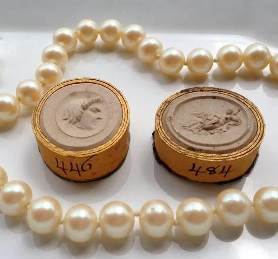
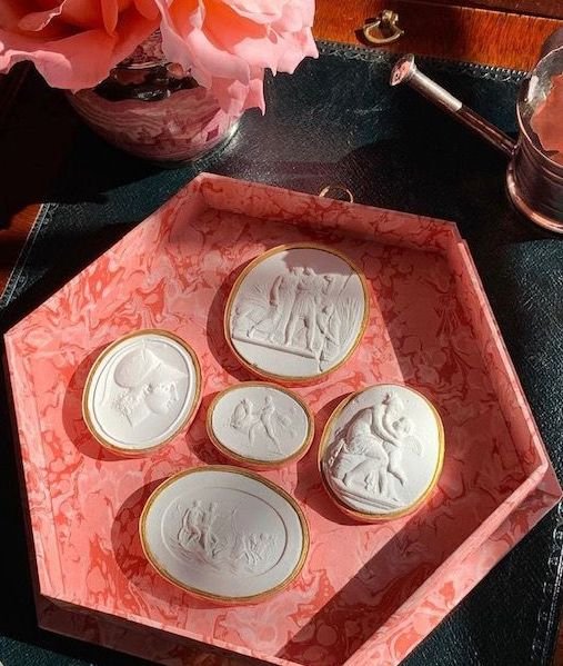
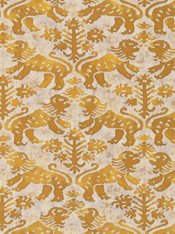
This image was my starting point as far as wedding inspiration. I am obsessed with intaglios, but I really loved the colors and the oval shapes. (From Parvum Opus)
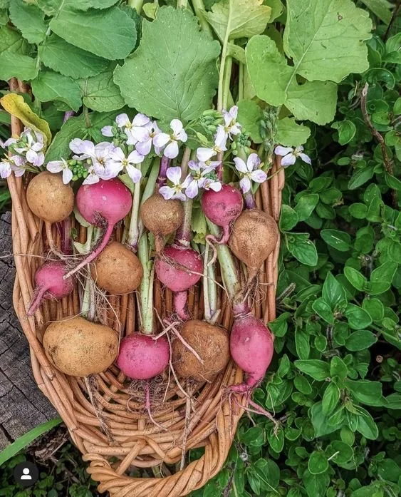
Hillary’s engagement ring is a triple stone ring of diamond ovals, so that was a fun correlation.. I’m not sure how radishes relate to a wedding, the colors, I suppose, but Happy reported that I totally got it, so I think she must have been inspired enough to proceed! Here are a few more examples of photos I shared with Happy.
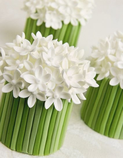
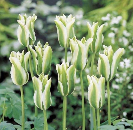
Remember these leaves! I will reference them later in this post!

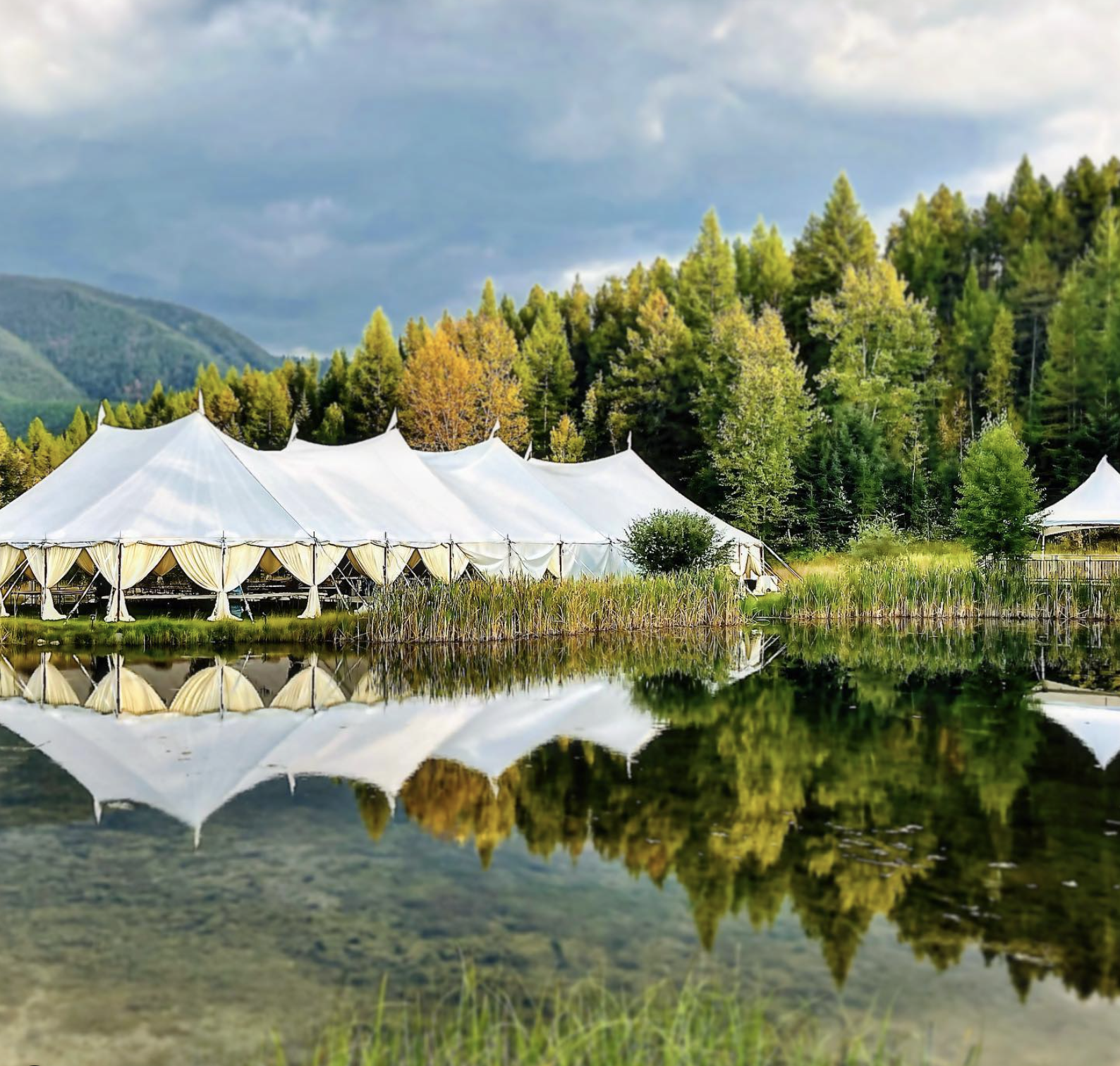
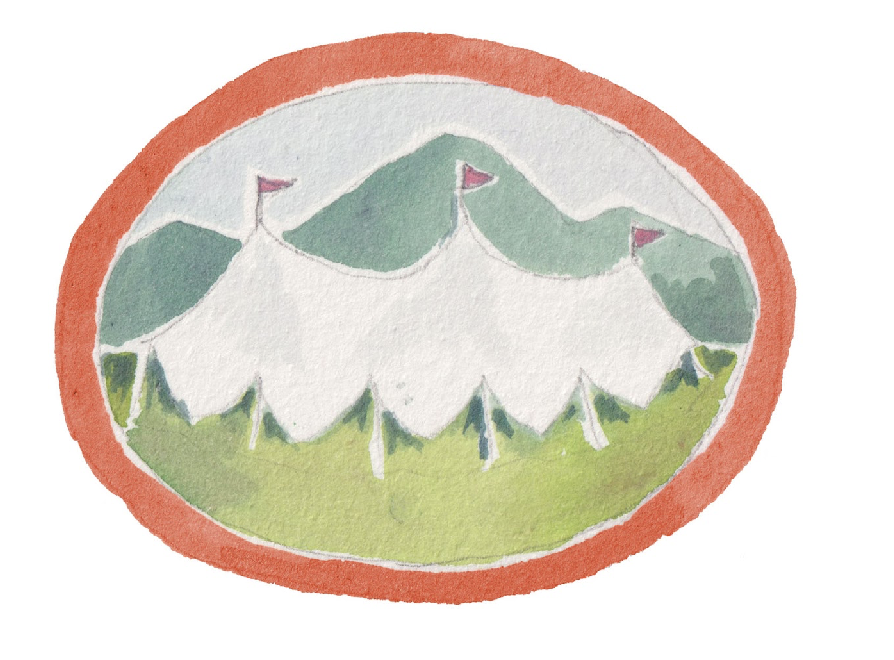
I also shared a few tent images set up at the venue, Green Valley Ranch, for reference.
Once Happy had the questionaire answers, and reviewed the inspiration board on Pinterest, she worked on an overview sketch presentation. Here, she creates a collection of all the pieces she will be working on in a draft form. When we received the below, we literally could have and would have answered, “Yes to all, and thank you.” We loved every single thing. I just wanted to keep talking about it and stare at it and plan more details. But the next step was waiting for the right time to do that. We were so anxious for the next phase!

Finally it was time to do the save the date. We sent Happy the official text, and I imagine she re-visited the overview sketch above, and she presented a couple save-the-date options. It’s hard to use restraint because you want this first piece of communication to be the most special thing anyone has ever received. But there is so much more to design, so you have to hold back a bit… save some of the beauty for later.
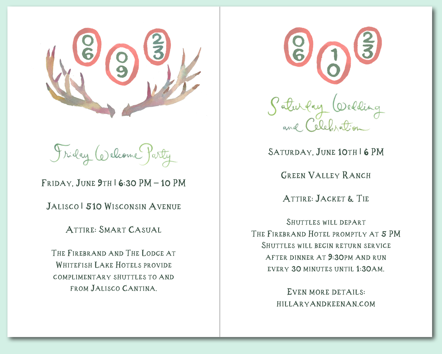
The wedding date ovals as shown above in the overview sketch seemed too plain by themselves - especially after seeing some of the fancier versions of Happy’s emblems! Not everyone would know Hillary had a ring with three ovals, so that connection would be lost to most recipients. I felt something more was needed and suggested adding a bow for a bit more interest.

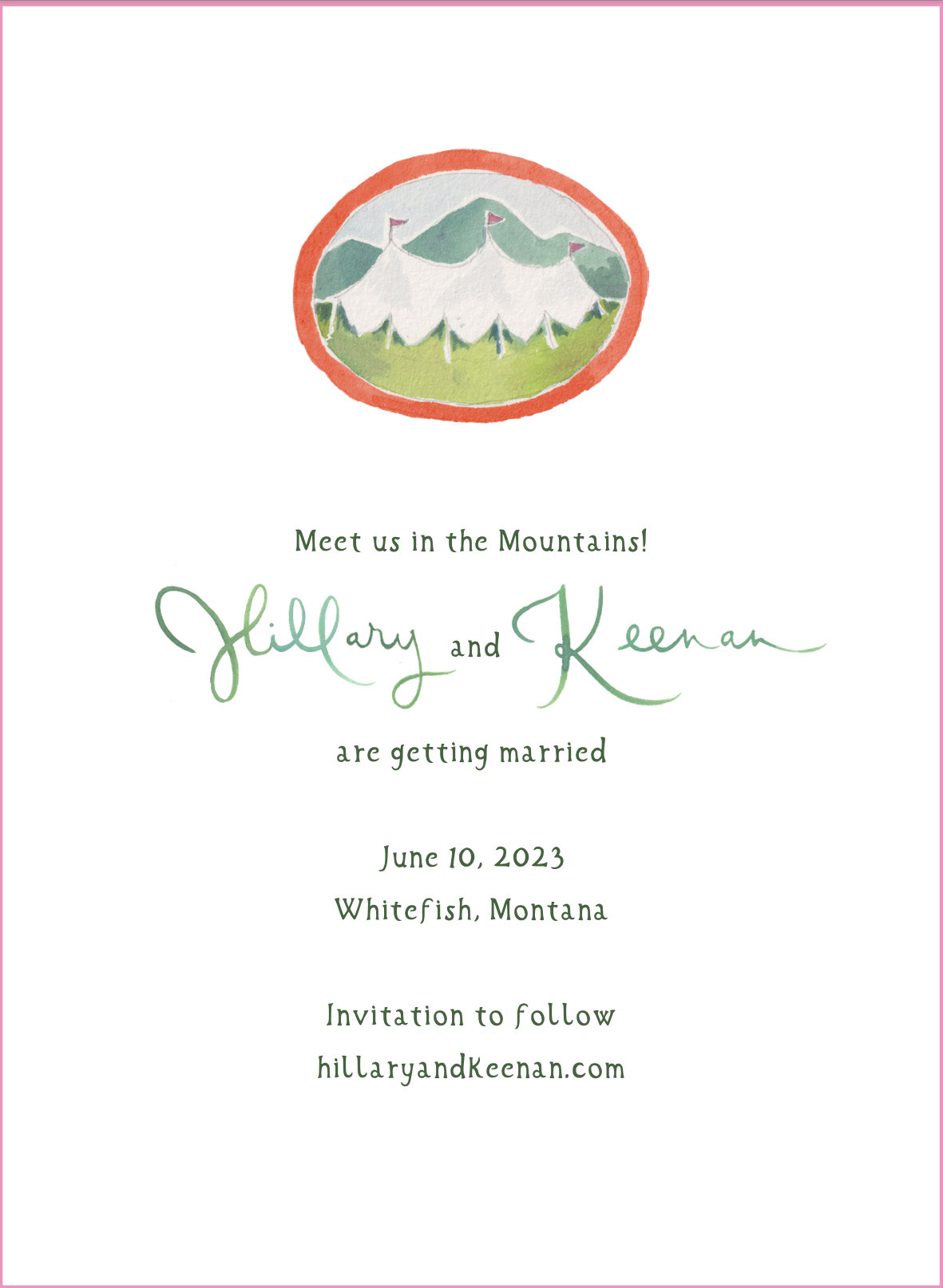
We were immediately taken with the oval tent from the original overview sketch, and that was also an option.
After a couple adjustments, we ended up here:

The original envelope was orange, but I really wanted the unusual flap shape shown above, and that particular company only offers certain colors. Although she showed painted envelopes for the invitation suite in the overview sketch, we ended up going with this pistachio green envelope all the way through. We love it.
I really adored the oval dates and the added bow with a bit of a Dr. Seuss feel, especially the colors, but Hillary ultimately chose the oval tent. I mean could it be any cuter? She liked the idea of it serving as a portal to the wedding weekend in Montana.
I had my friend Amber at Village Needleworks paint the tent on a canvas and got to work stitching. The paperweight is already on Hillary’s desk!
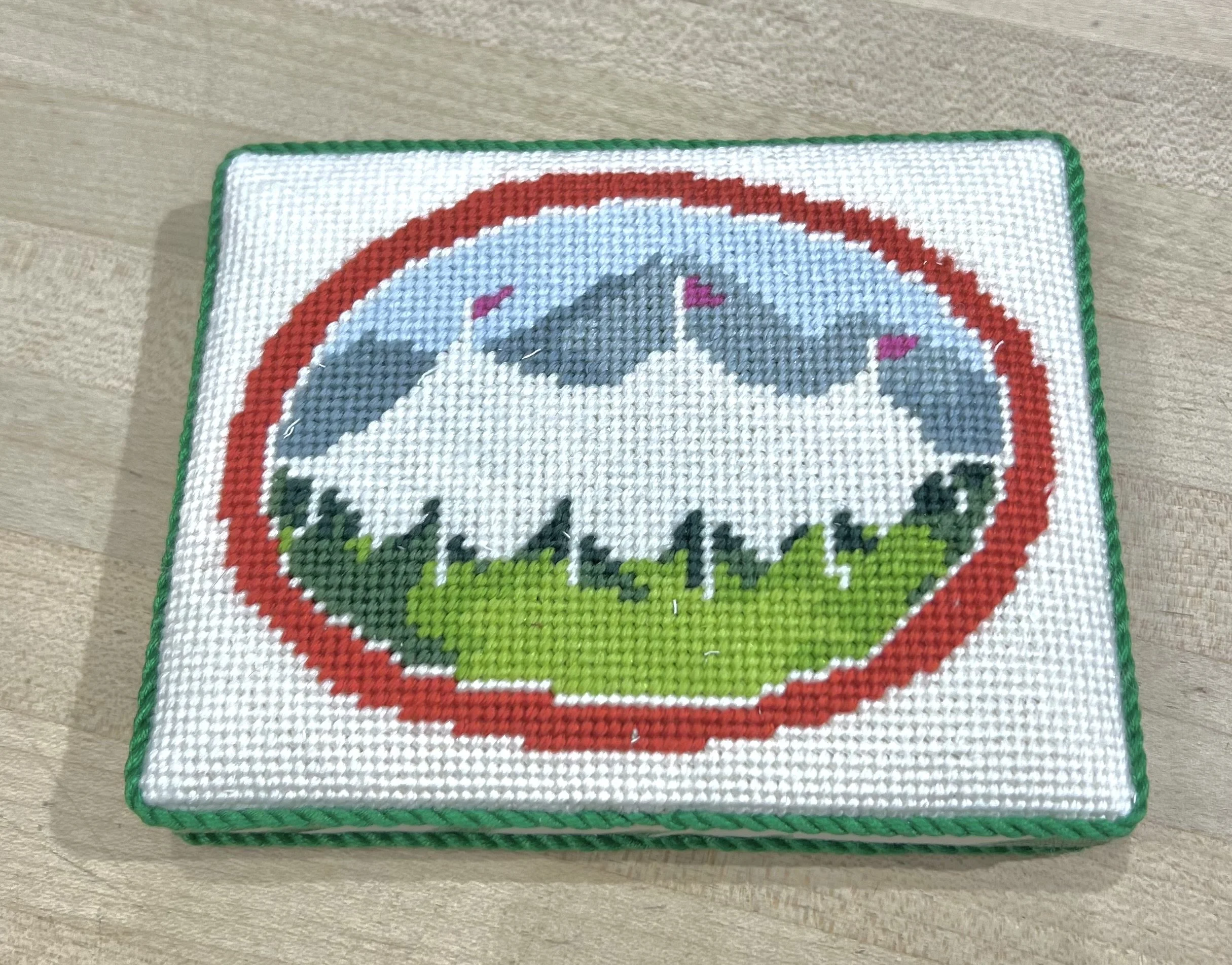
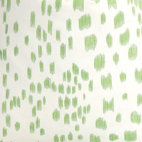
We used Bruncshwig & Fils Les Touches fabric on the sides and back, and you’ll see that motif a few more times in the wedding design plan. In fact, I’m already working on that post!

Next came the invitation.
The first round was a bit of a surprise. Green was definitely the predominant color we were going for, and we absolutely loved the rendering she did with the light green leaves design on the front of the envelope in the overview sketch, but this first presentation was pretty different than her initial sketch.

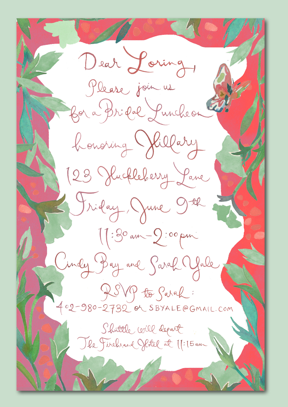
The green was darker and murkier, and paired with the bright coral red on the bridal luncheon card, it was too bright. I was confused by the lily pads. They seemed tropical to me and not what we were going for. At some point in the process, I looked back at the inspiration photos I had provided, and saw the photo with the leaves that surely inspired these leaves. (You can scroll up to see them, plain as day.) The Les Touches spots weren’t quite right.
Here are some of the other details from the first round.
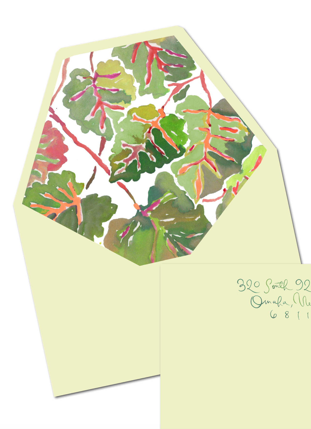
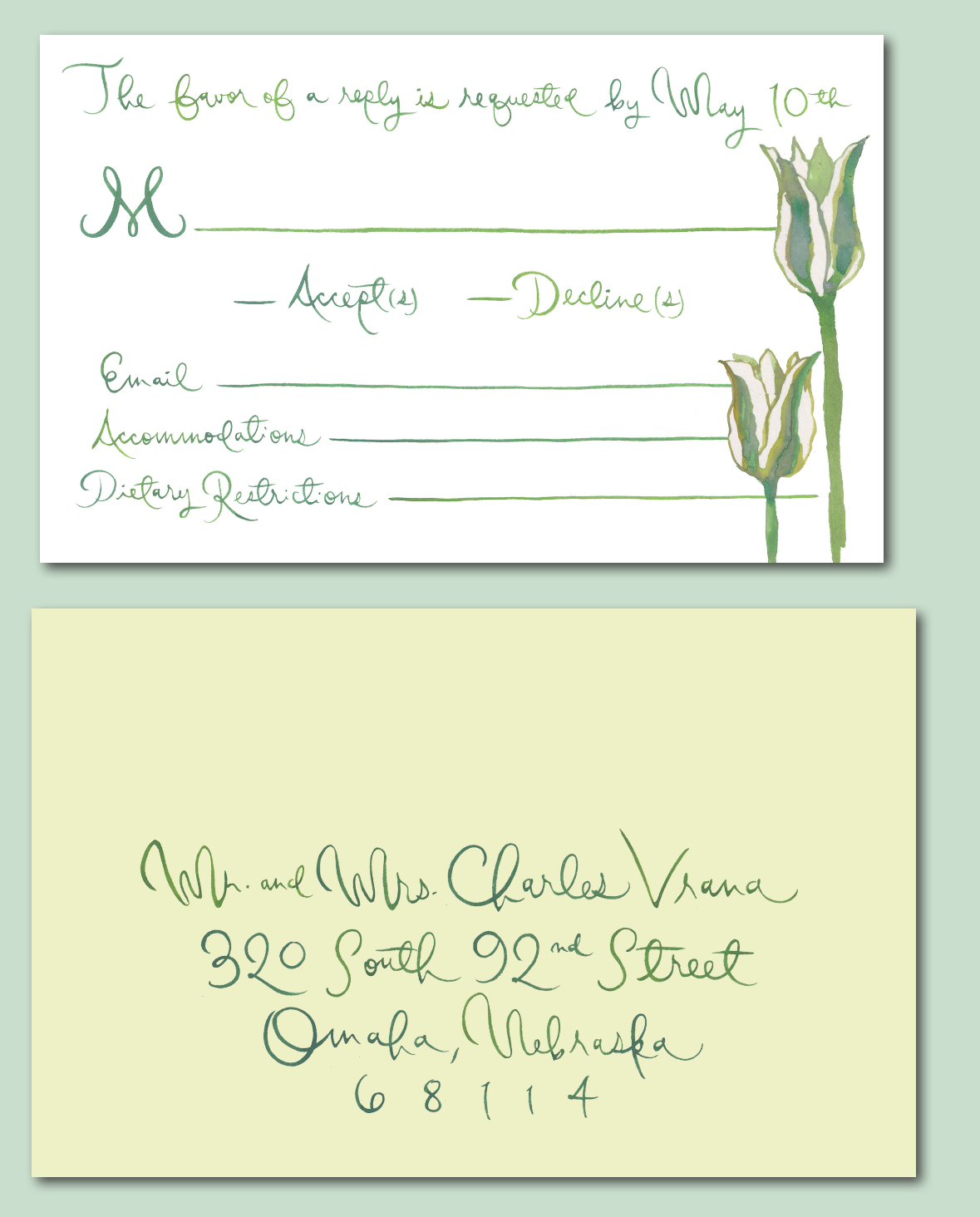
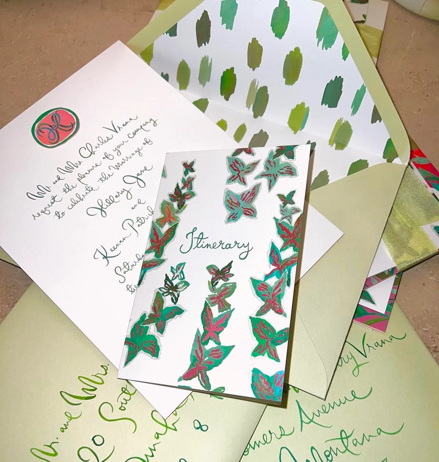
Although Happy can do no wrong in our eyes, we shared our feedback and decided to ditch the painted outer envelope idea altogether. We requested the plain light green envelope to match the save-the-date envelope, with a painted liner. I wanted large calligraphy writing on the envelopes, and removing the artwork on the envelopes was the only way that could happen.
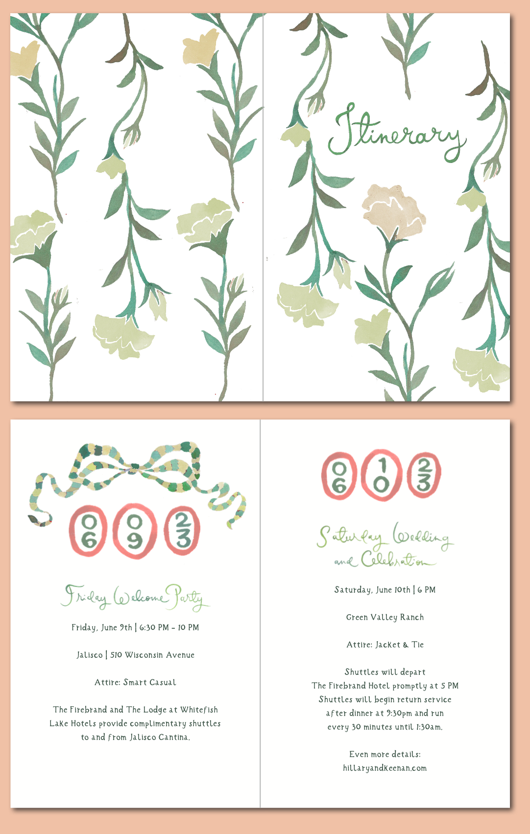
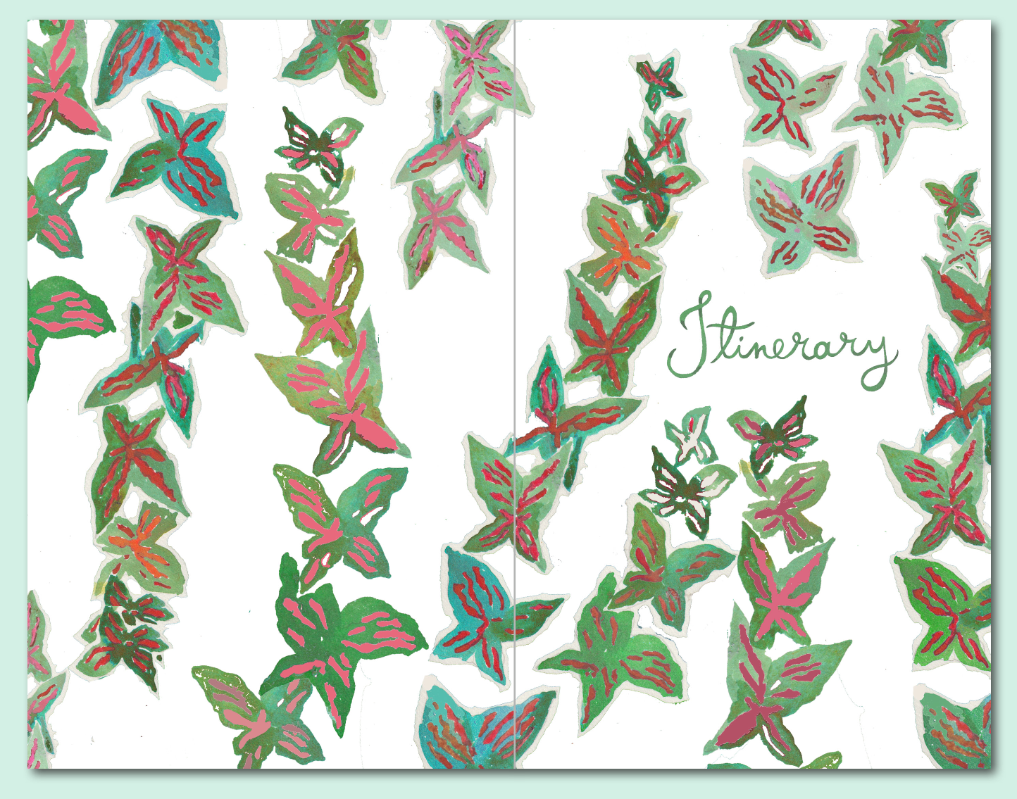
We liked antlers instead of the bow on the itinerary. (I love that bow! I still want to use it somewhere, someday!)
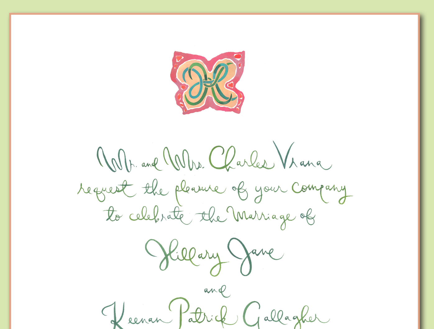
And we introduced the idea of butterflies instead of the lisianthus flowers for the itinerary cover. We originally requested the lisianthus flowers because they are on the wedding dress, but we wanted to see something else. The colors were slightly drab. I sent a photo of this cool green plant with interesting butterfly shaped leaves.

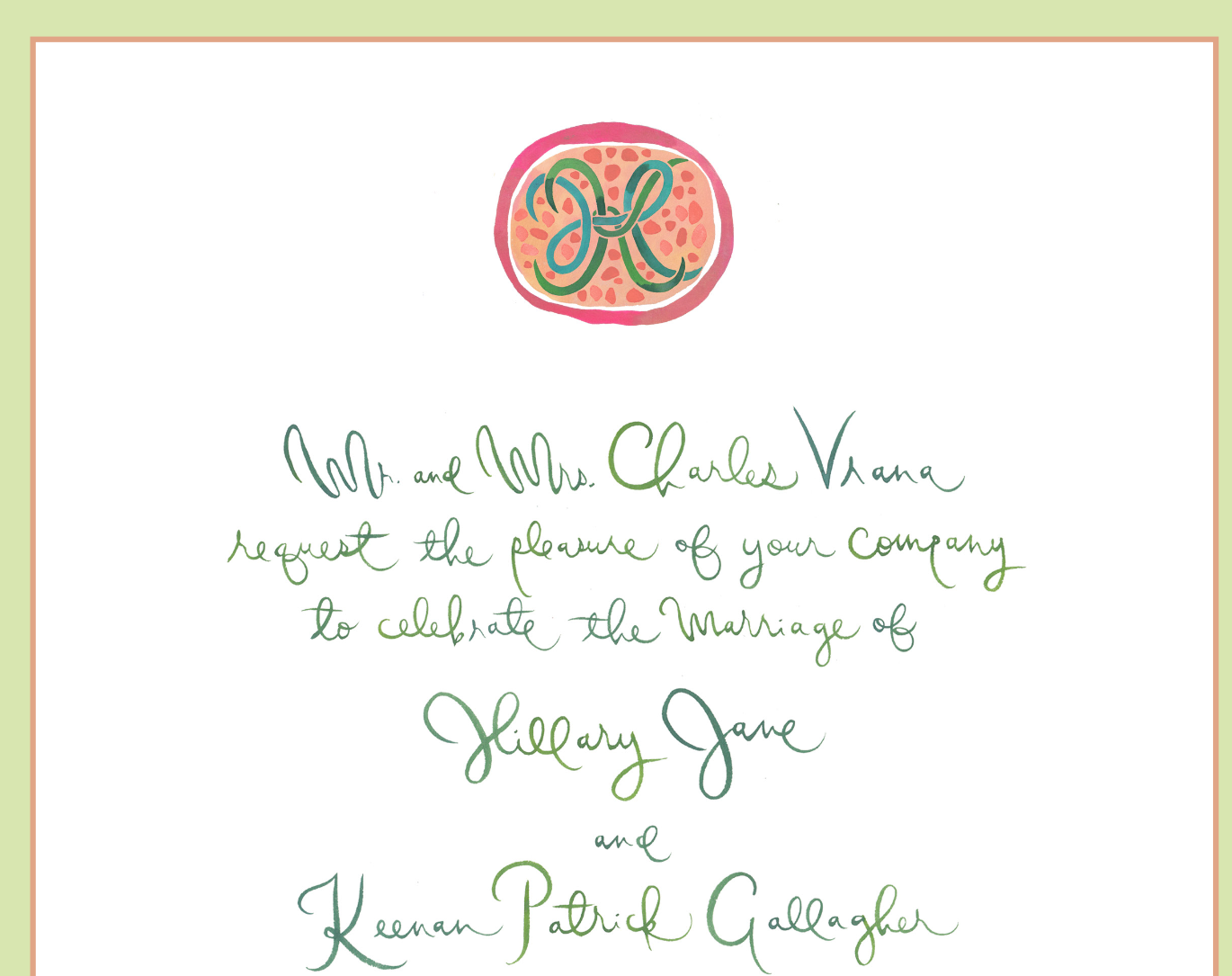
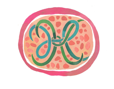
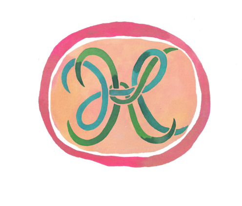
We also requested a more simplified version of the oval emblem - sans polka dots. (as cute as they were!)
Here are some of the designs from the second round:
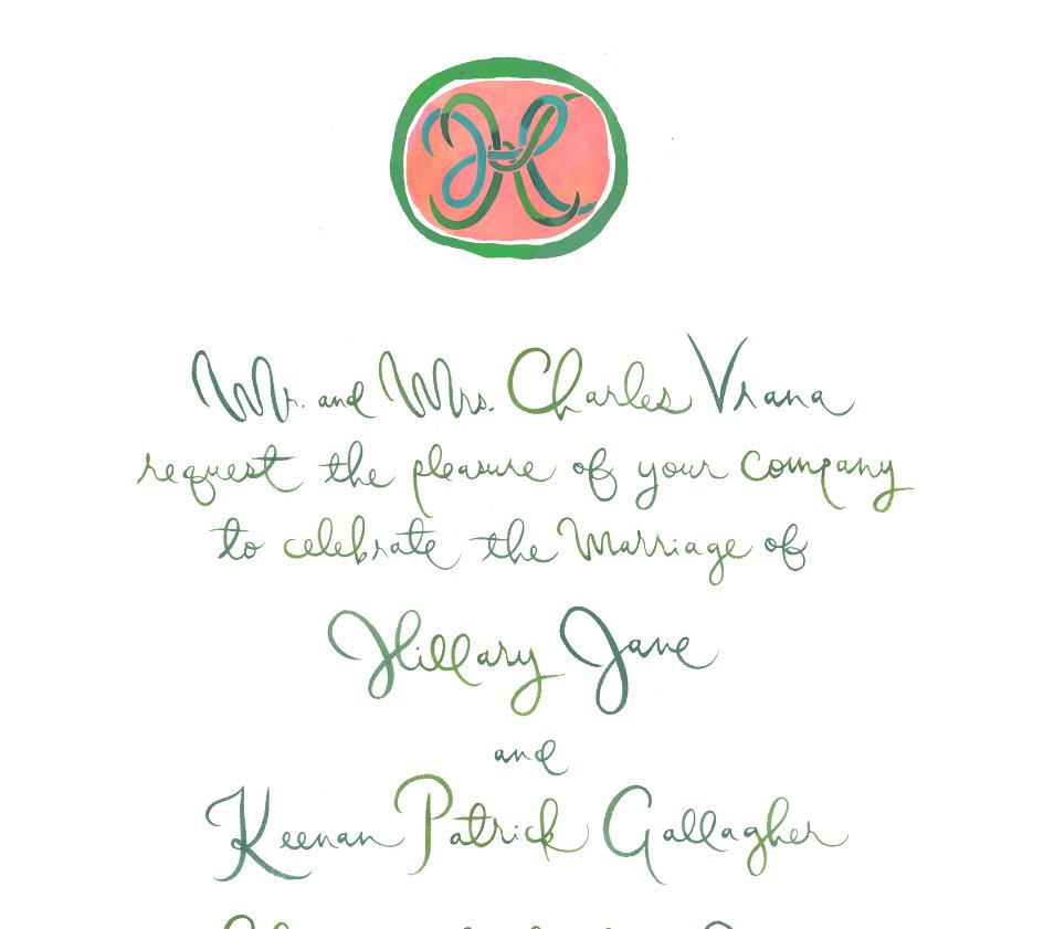
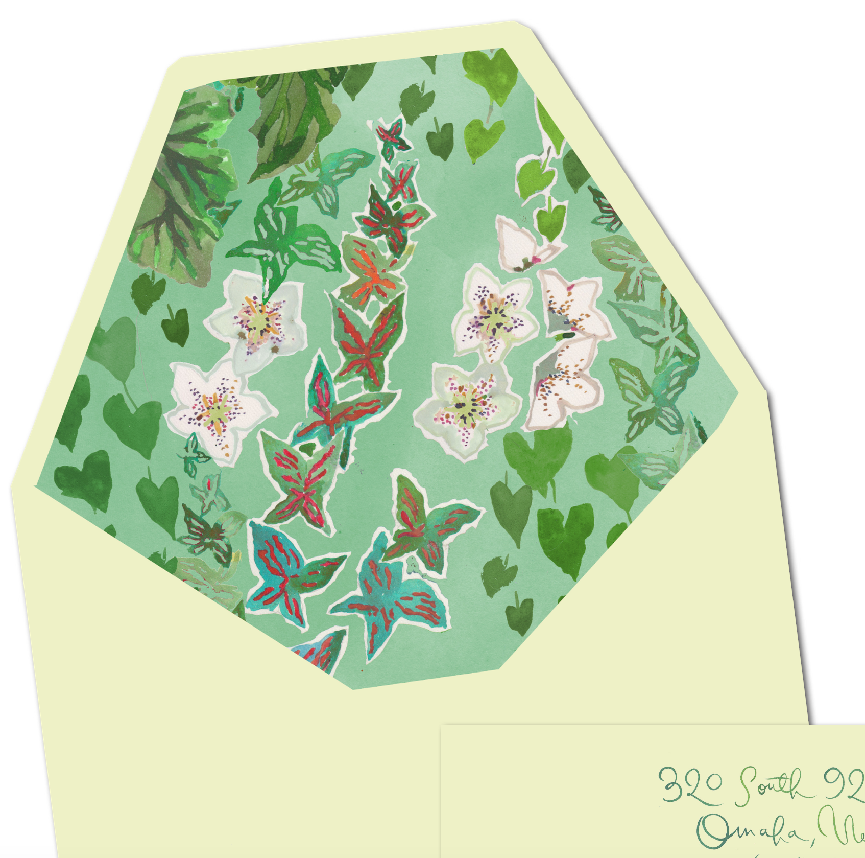
We were getting closer. Loved the plain oval emblem with the green rim. We stuck with the original bridal luncheon card and welcome party card, and although we loved the addition of the crazy butterfly leaves on the envelope liner, with everything else going on, it was too busy. We requested either leaves or the Les Touches spots for the liner, and we asked about using the colorful butterflies on the itinerary.
Our next presentation proved to be the final one.
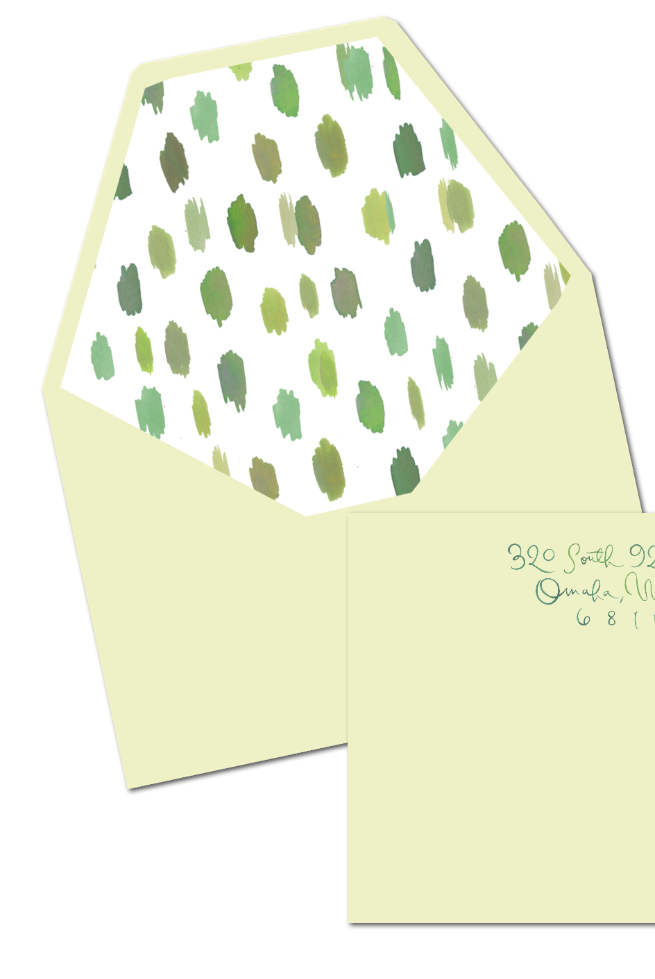
Loved both options for the envelope liner:
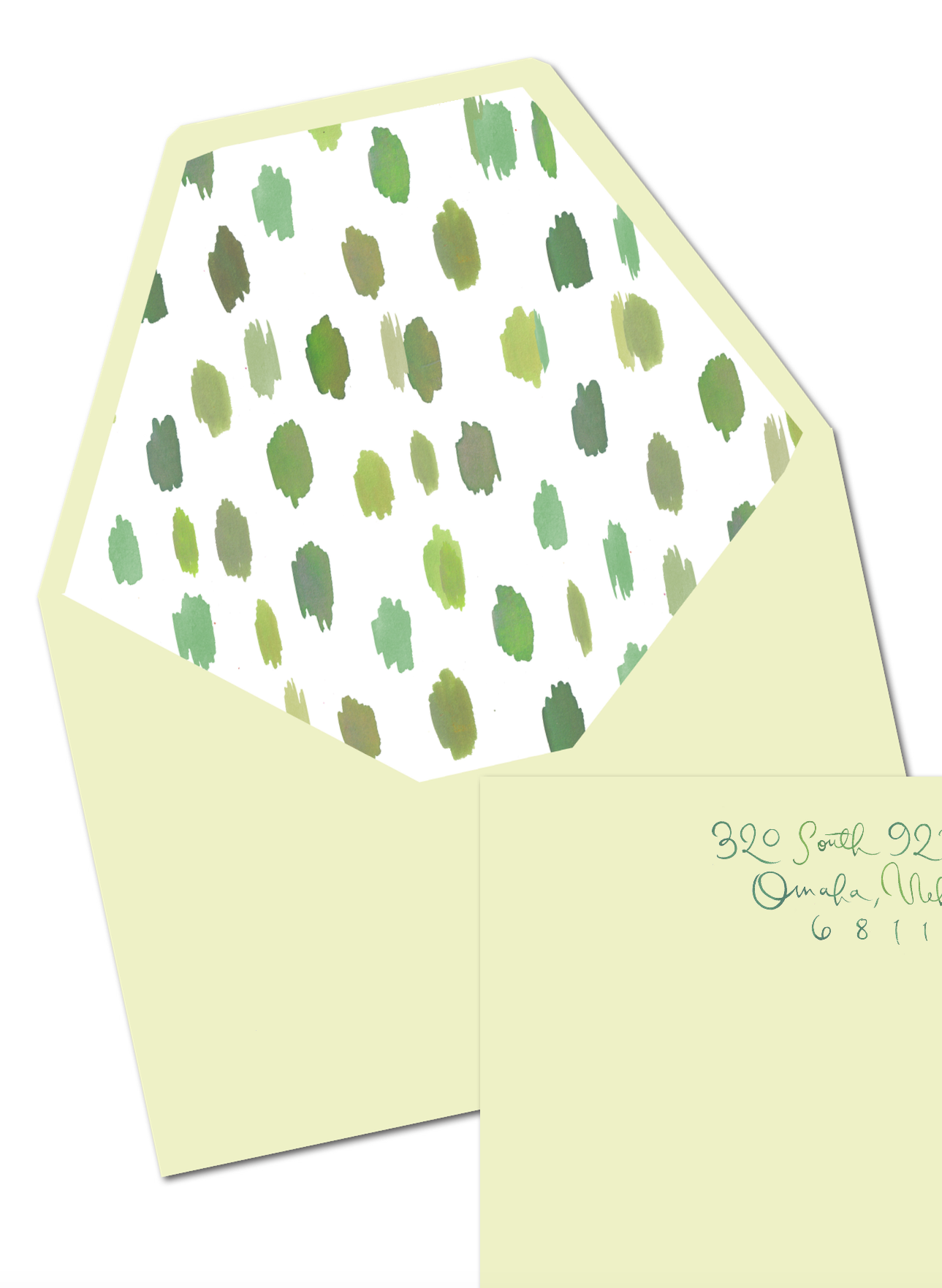
Our wedding planners, Darci and Arden Greenwood, of Greenwood Events, who were instrumental in helping me edit and use restraint, reminded us that the Les Touches fabric design could be a recurring theme in the design department, and we loved the simplicity.
The new colorful butterflies on the itinerary were fun, and we loved the plain antlers and oval dates.
Loved the painted edges and the grass green ribbon to tie up all the goodies.

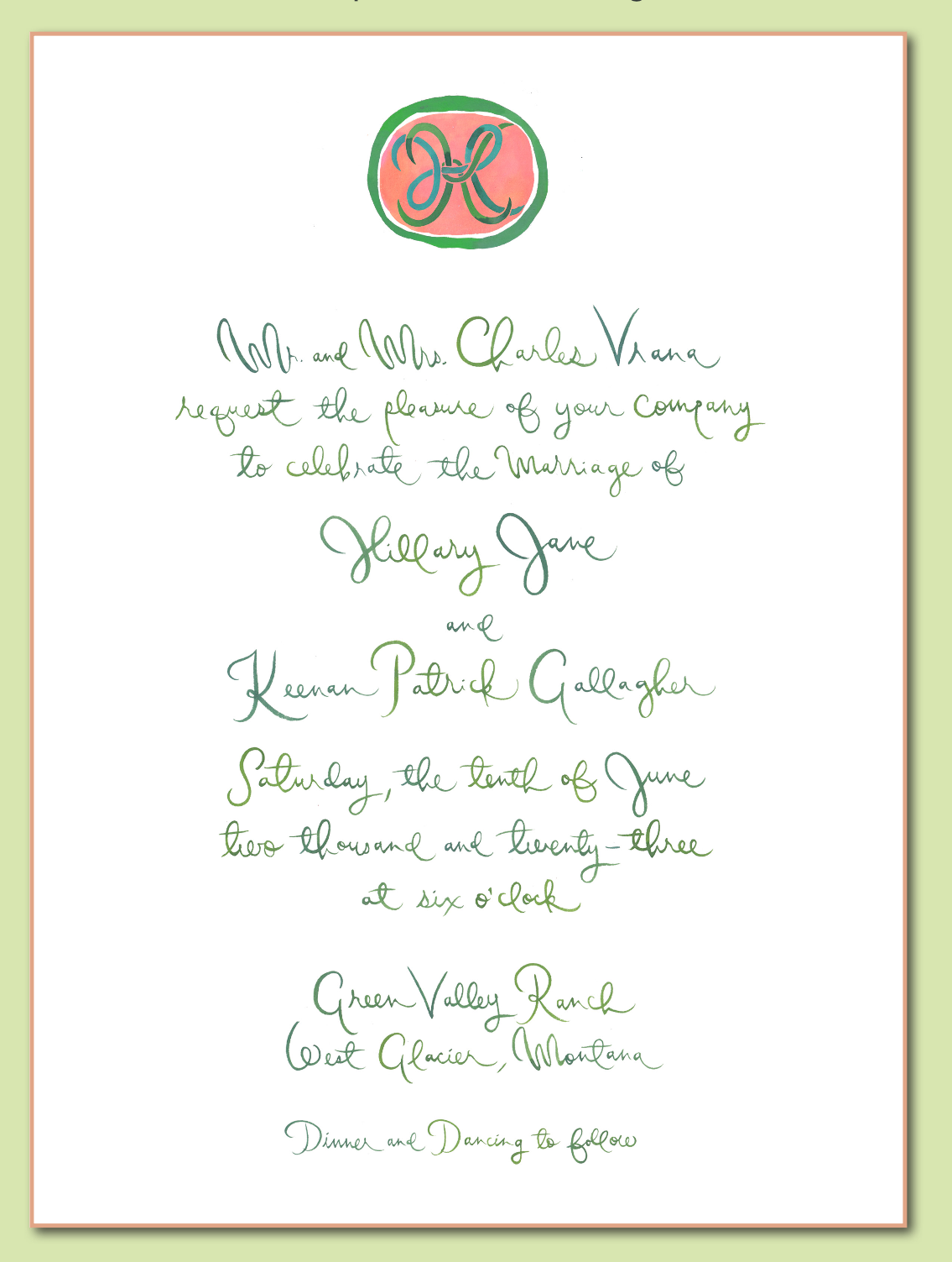
The invitations arrived in time to mail around Saint Patrick’s Day which seemed appropriate..
I especially loved the hand-painted calligraphy on the envelopes with sort of an ombre effect.


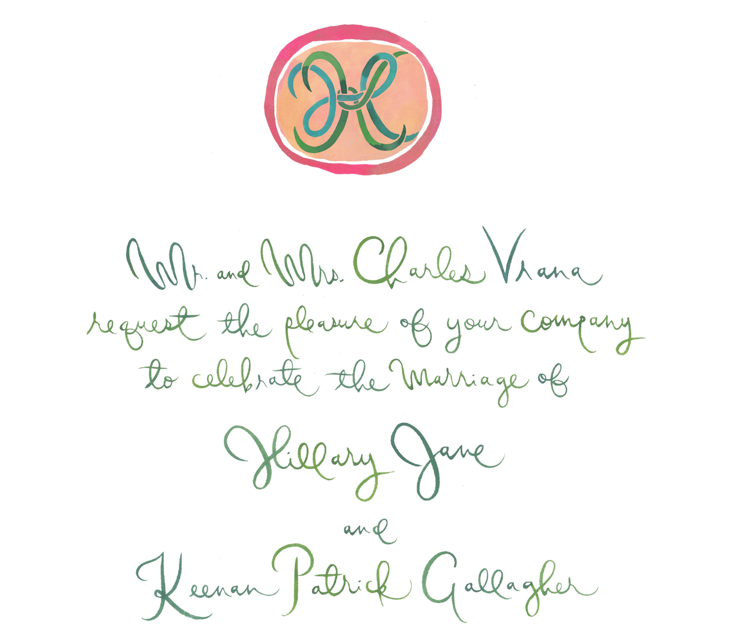
Invitation suite complete!
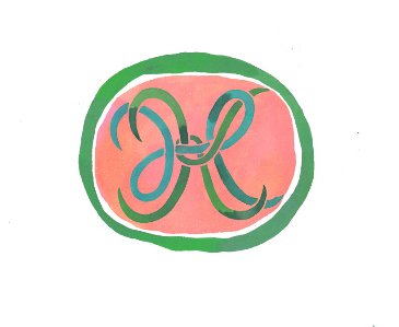
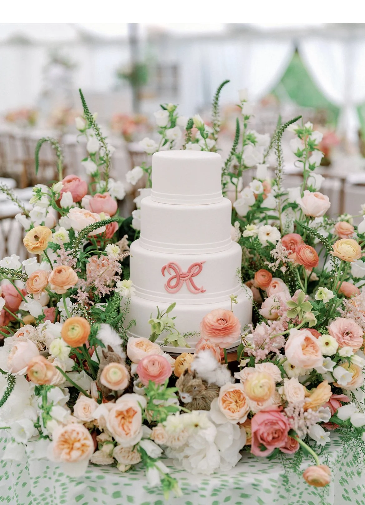
A few emblems came out of this design process.
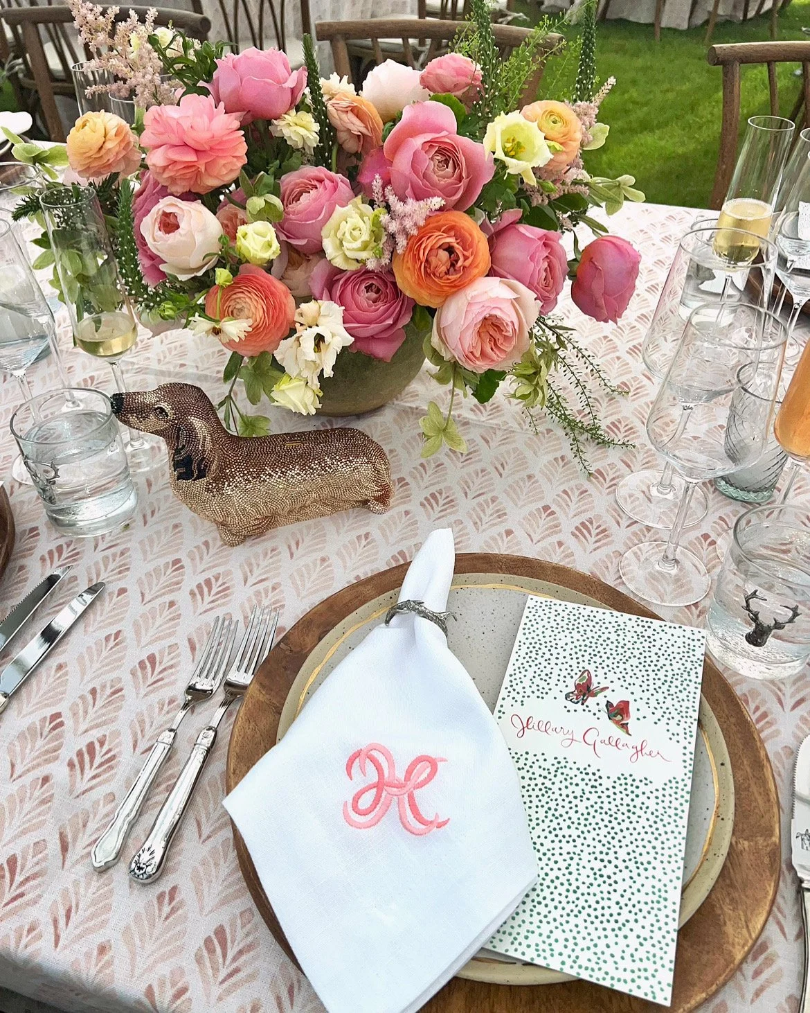
We really loved the HK by itself, and that shows up in a few places at the wedding.
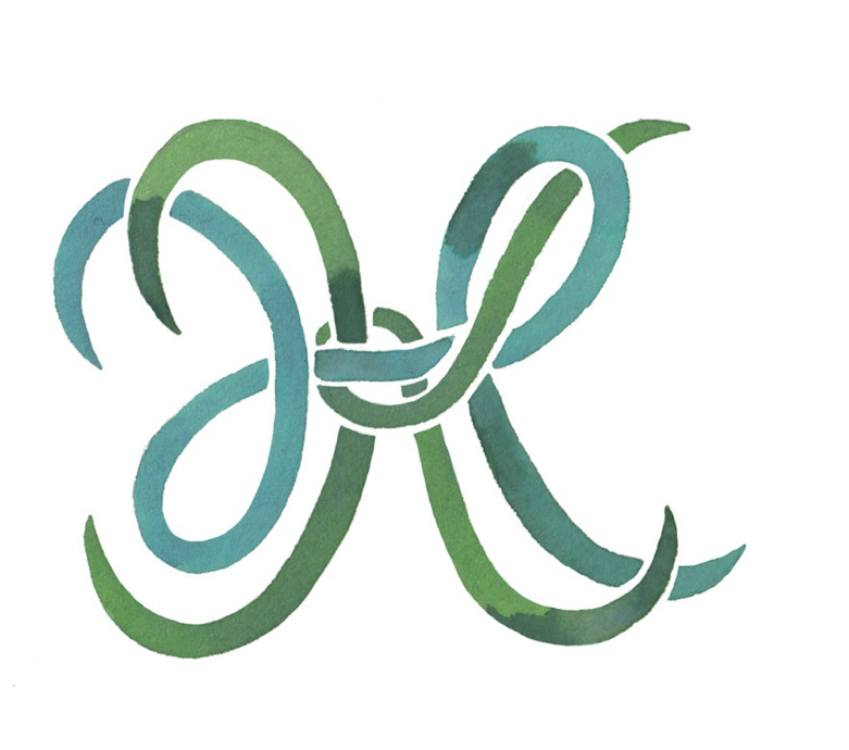
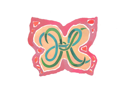
We changed the colors of the HK monogram and used it as the only decoration on the cake.
Also used that monogram on the napkins!
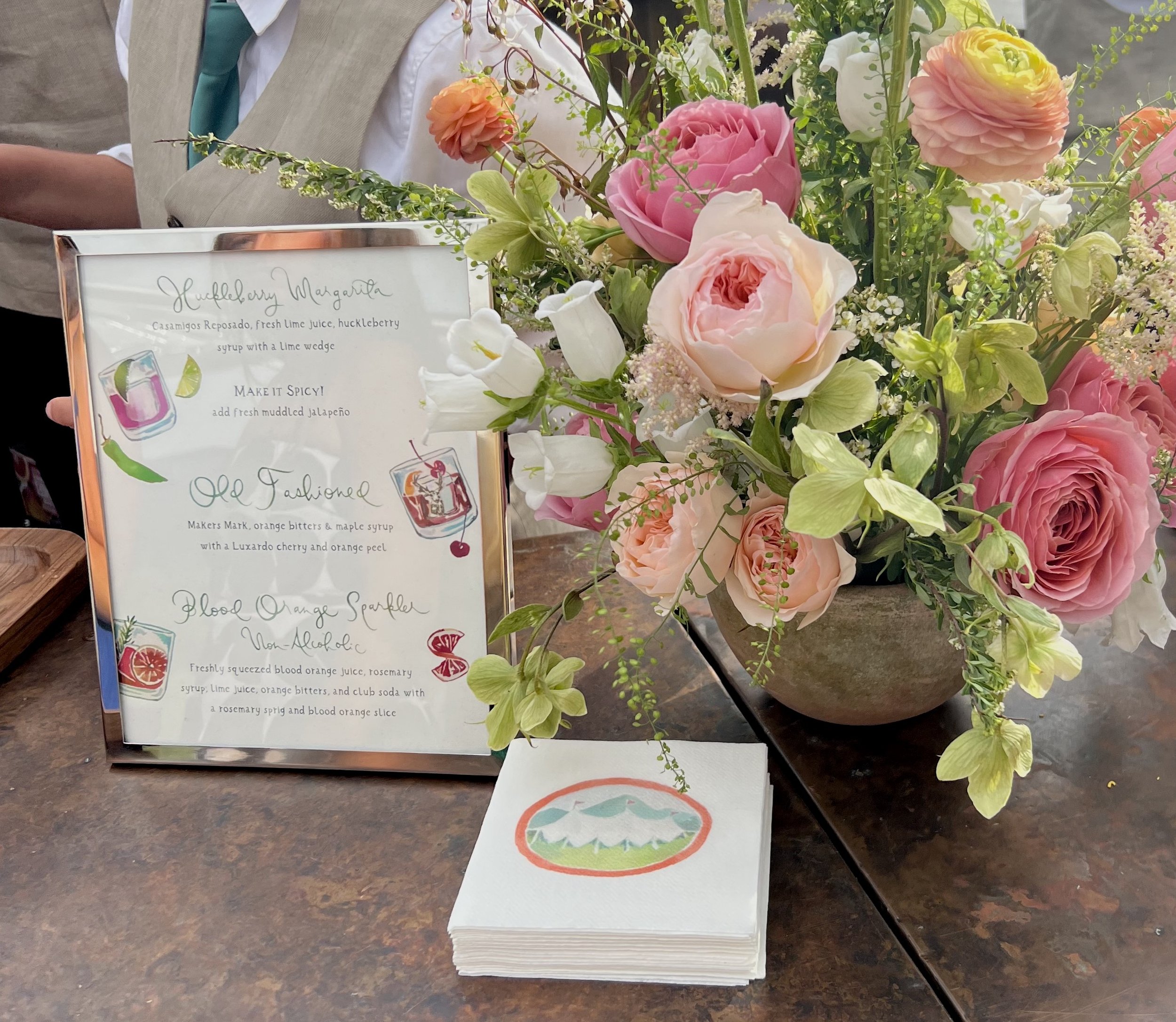
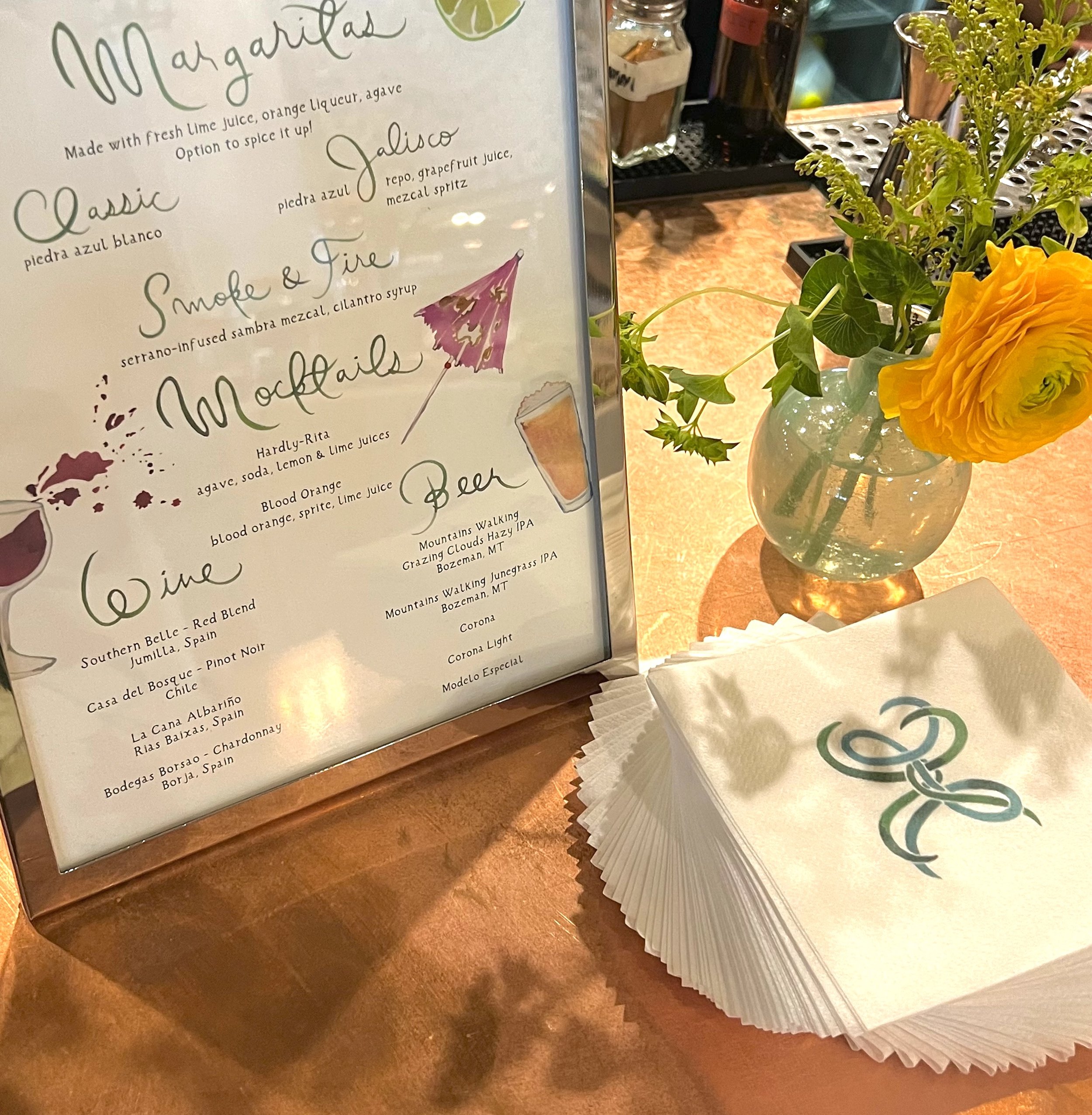
Here you can see the tent and the HK monogram on cocktail napkins.
Our photographer, Steve Steinhardt, put together a beautiful flat lay of the invitation.

You can see Hillary’s oval diamond engagement ring and my oval diamond earrings were a perfect match. I used bunny stamps for the return envelopes because aren’t they the cutest? Modern geometric green stamps for the outer envelope. The bridal luncheon card is not shown here and only went to the bridal party and a few friends and family.
At the bridal luncheon, the day before the wedding, we were chatting about options for something blue, and my friend casually said she had something Hillary could use. She proceeded to pull out a stunning sapphire ring - literally Princess-Diana-style. Hillary and I giggled and agreed that yes, that should do the trick. What a fun and unexpected addition to the wedding look!
Follow along on instagram for lots of wedding photos. There are already two full highlights! The professional ones are limited, but more will be coming by end of summer.
Also, I’ve been adding wedding related photos to my Pinterest boards. I hadn’t paid attention to Pinterest in years, so that has been fun to become reacquainted with. All “secret” boards are no longer secret, so help yourself to that inspiration.
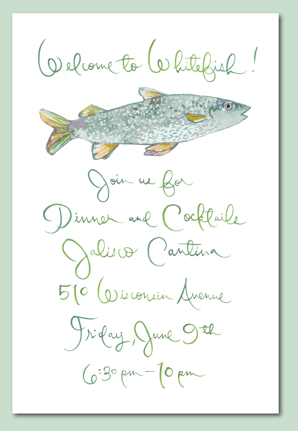
Still to come: Lots more wedding content including the gorgeous artwork for day of paper which was a new term for me, and oh, is it fun!
Wedding Planners: Greenwood Events
Wedding Paper: Happy Menocal
Photographer: Steve Steinhardt
Needlepoint: Village Needleworks
Cake: Miss Patticakes