
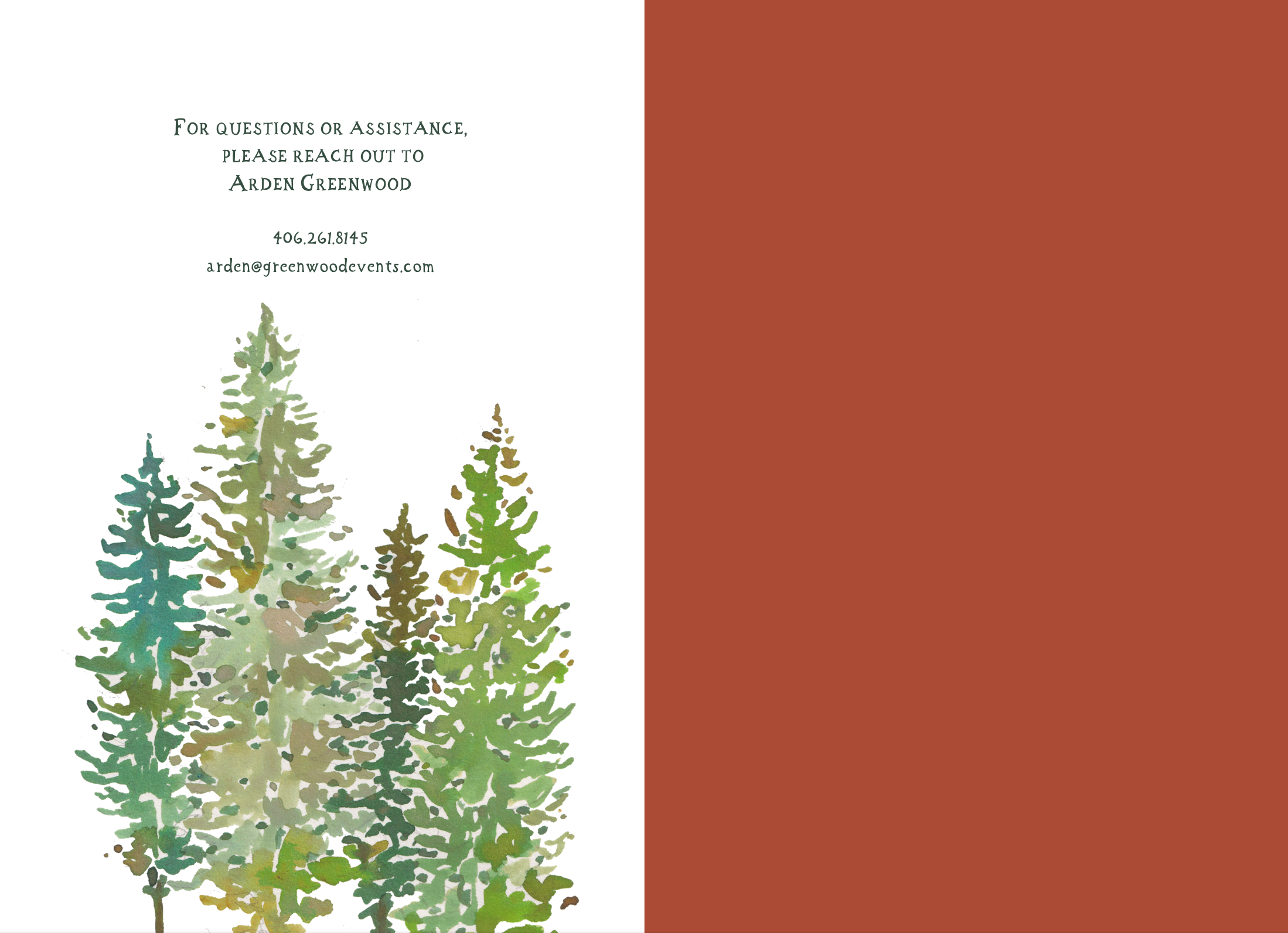
HAPPY DAY OF PAPER
I can’t say it enough. Working with Happy Menocal and her “house of artists, calligraphers, designers and producers” on this wedding weekend paper collection was a dream come true. As I mentioned before, day of paper was a new concept for me. At the very beginning of the process, I was asked to list all the pieces we were interested in having Happy design. When I got married 35 years ago, we had the invitation and a reply card, and that was pretty much it. These days there are maps, welcome books, and matching thank you stationery! Obviously a person can get by with less than all the pieces we chose to involve Happy Menocal with, but I saw every piece as an opportunity to see what else she could create.
We listed what we thought we would need, and those are the pieces that Happy included in her overview sketch.
Here’s a reminder of the overview sketch. The save-the-date and the invitation suite were already complete, so the bottom five things remained and represent the day of paper pieces. Until we started adding things. I’m sure we are not the first to add pieces as we got further along with planning details.
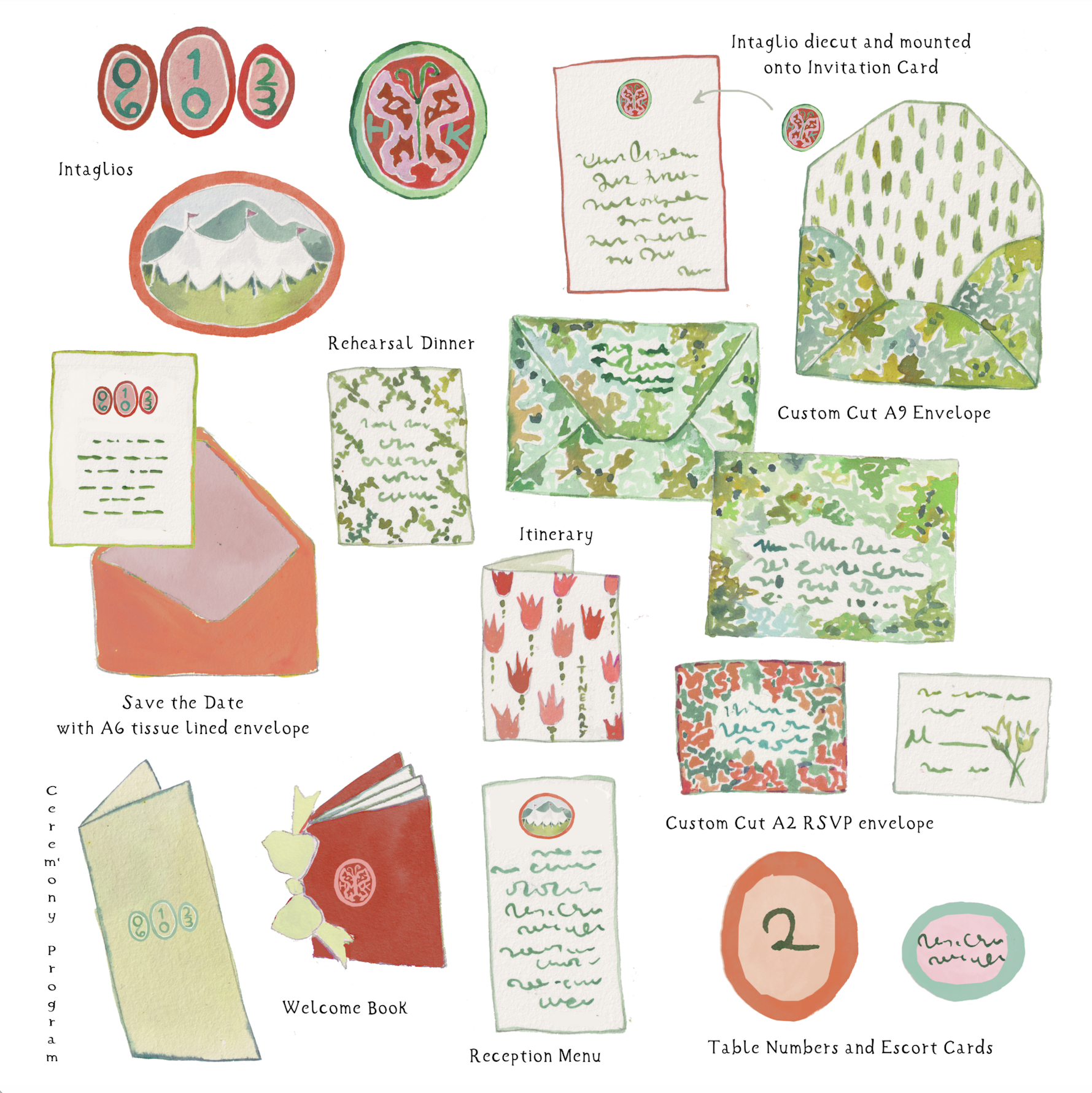
I put together an updated version of the pieces we had already completed, for reference.

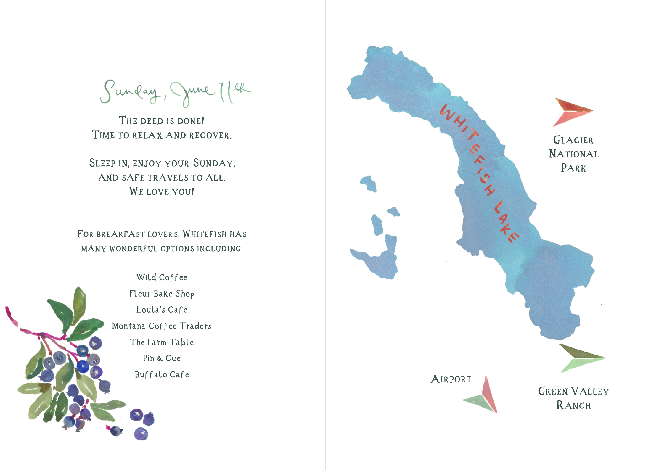
The day of paper pieces we had on our list at this time were the welcome book (which had several components in it) the ceremony program, the menu, and the escorts cards and table numbers.
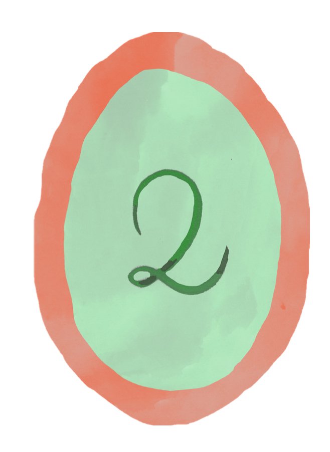
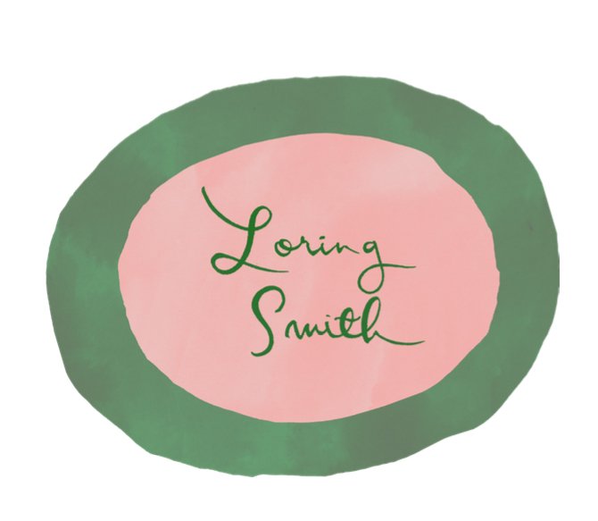
The escort cards and table numbers were a no-brainer. She pretty much stuck to the original sketch and we adored them. The names of each guest were on the front of the oval escort cards, with his or her table number on the back.
I didn’t realize she would do a combo of colors, but look how gorgeous the mixed colors were! We used several of the acrylic trays I sell in the shop, a combo of large and small sizes, and they were perfect. I also sent the green olive jar and the painted tole grape basket with the deer on it for Darci to use for flowers. I loved this table! The white Canterbury bells were a hit. I will use the custom tablecloth again, I’m sure.

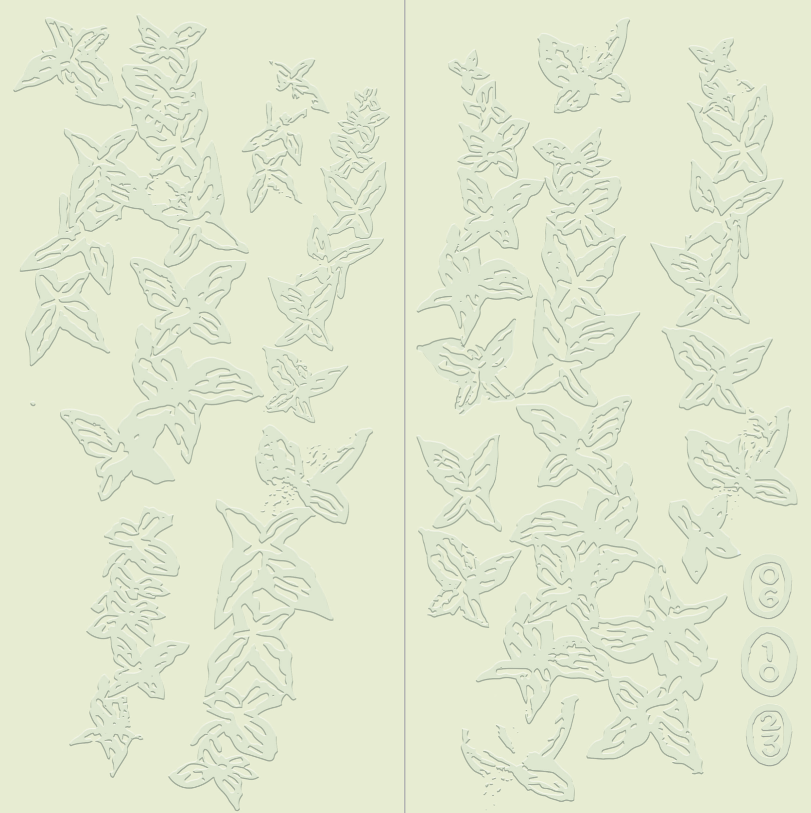
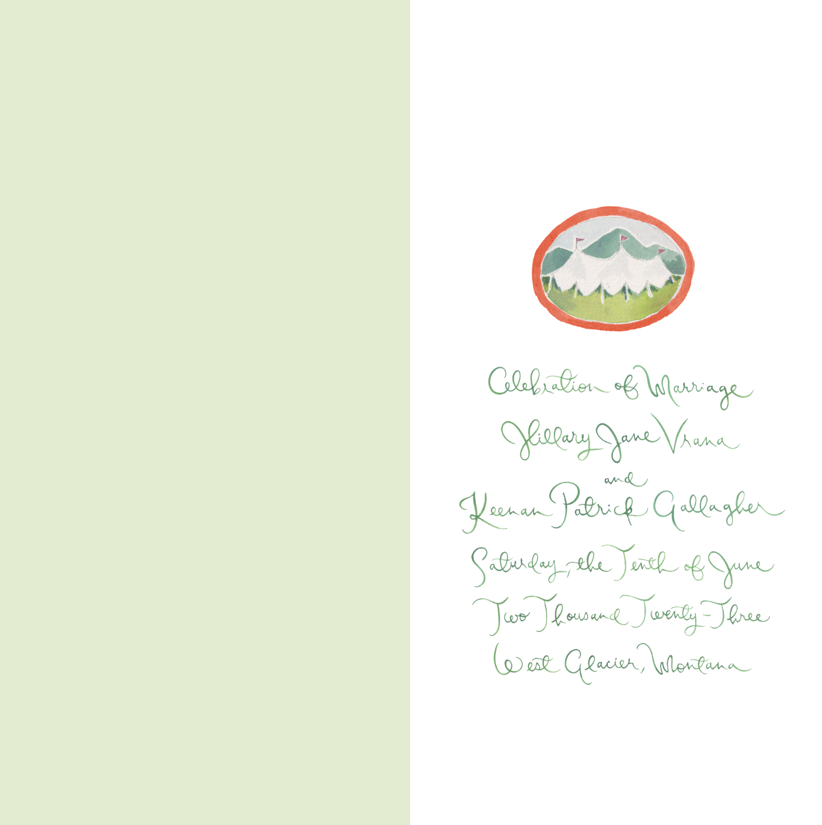
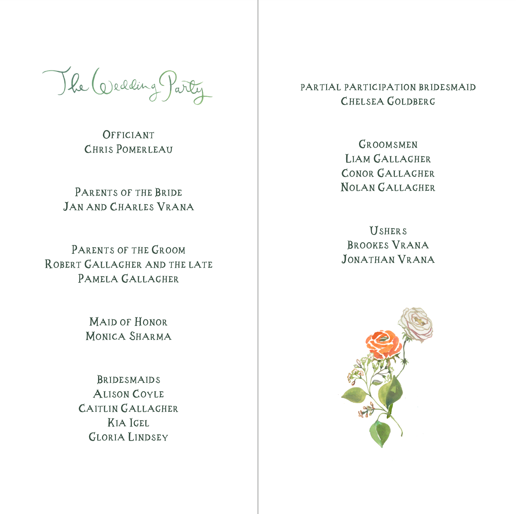
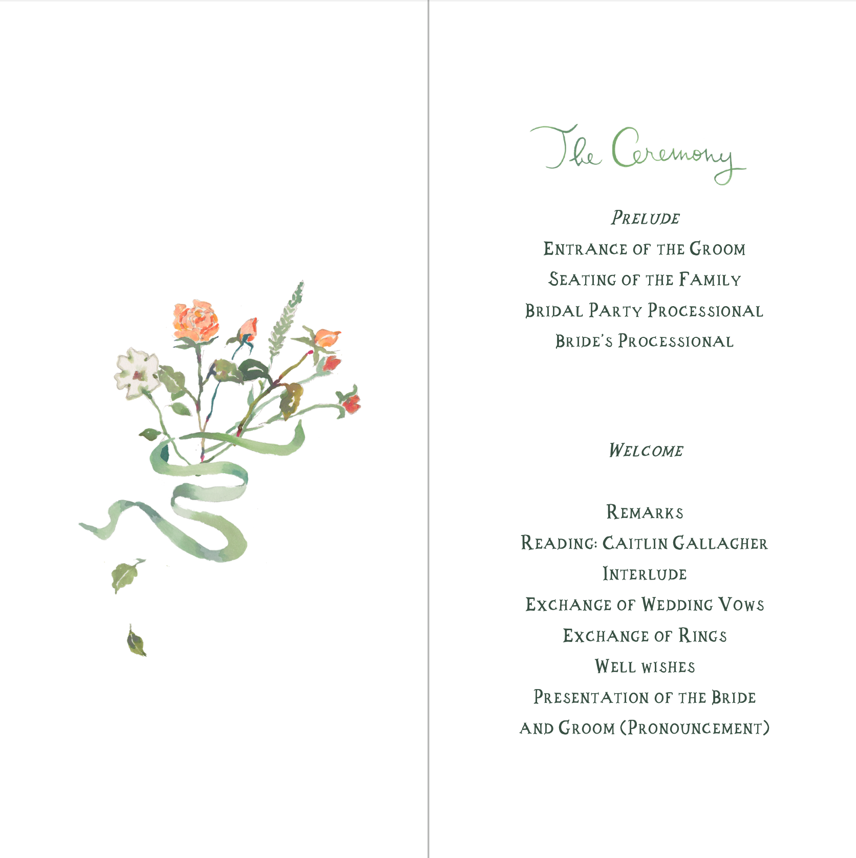
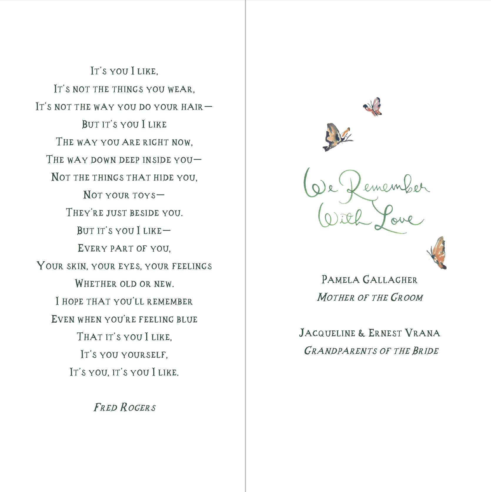
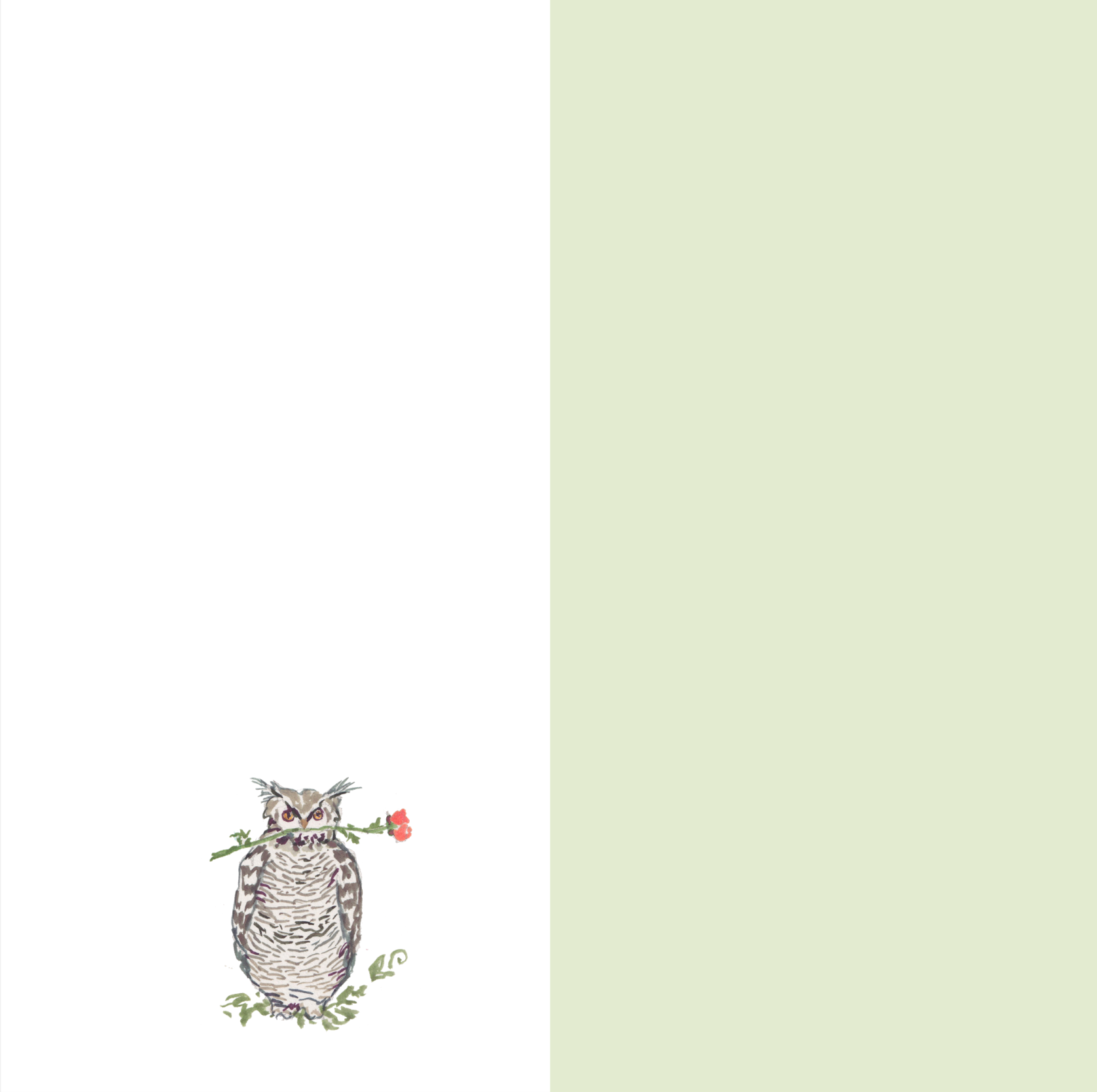
The ceremony program was perfect. I don’t think we made a single change to the design, just a couple text updates. I loved the embossed butterflies on the front, (remember the colorful ones on the itinerary?) and the oval dates in the bottom right corner. Loved using the pistachio green that matched the invitation envelope. And the owl on the last page is about as cute as can be.
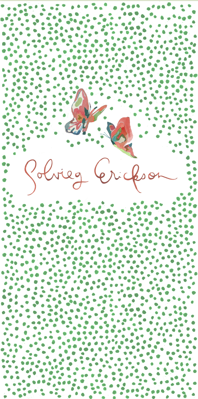
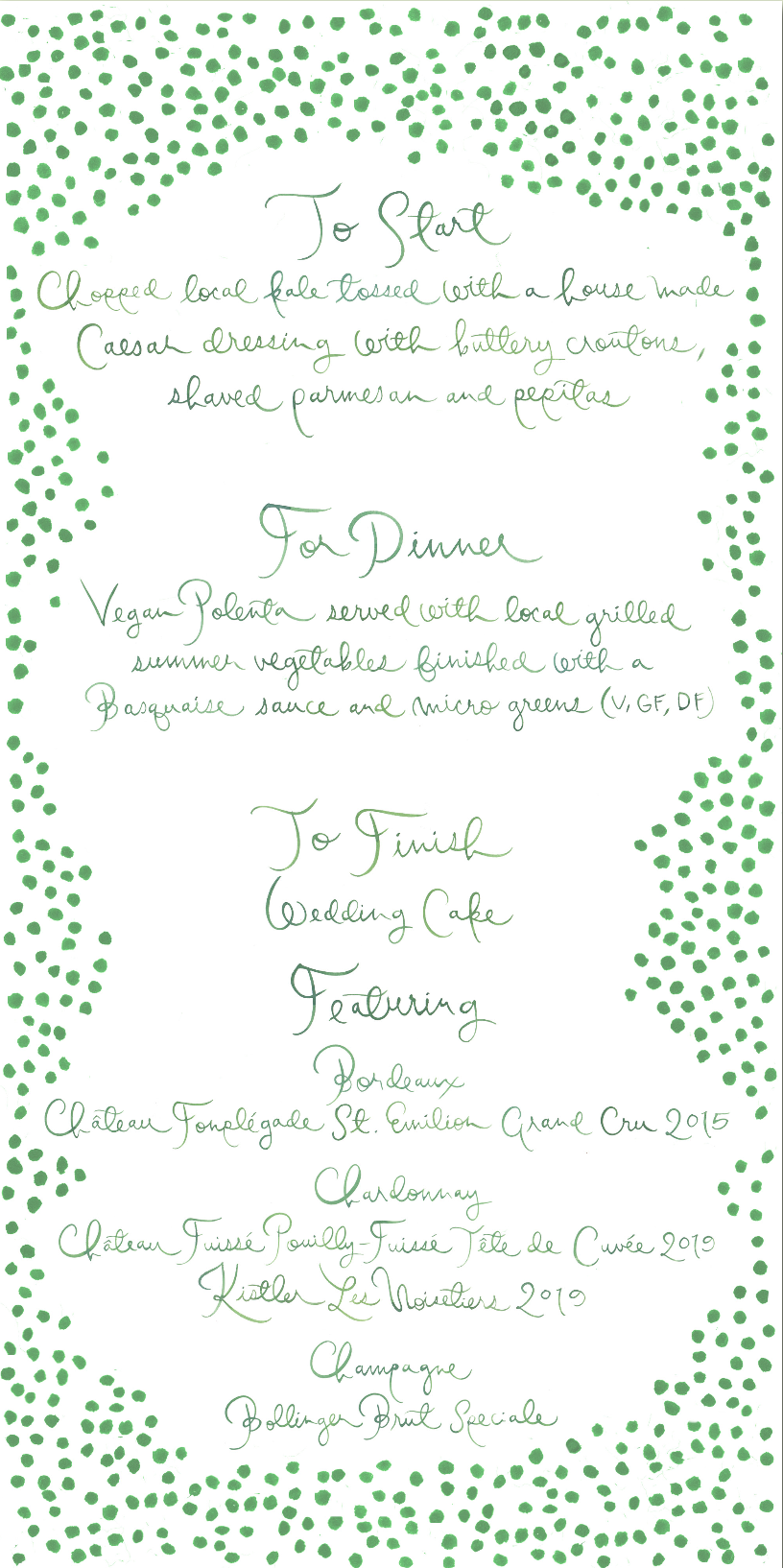
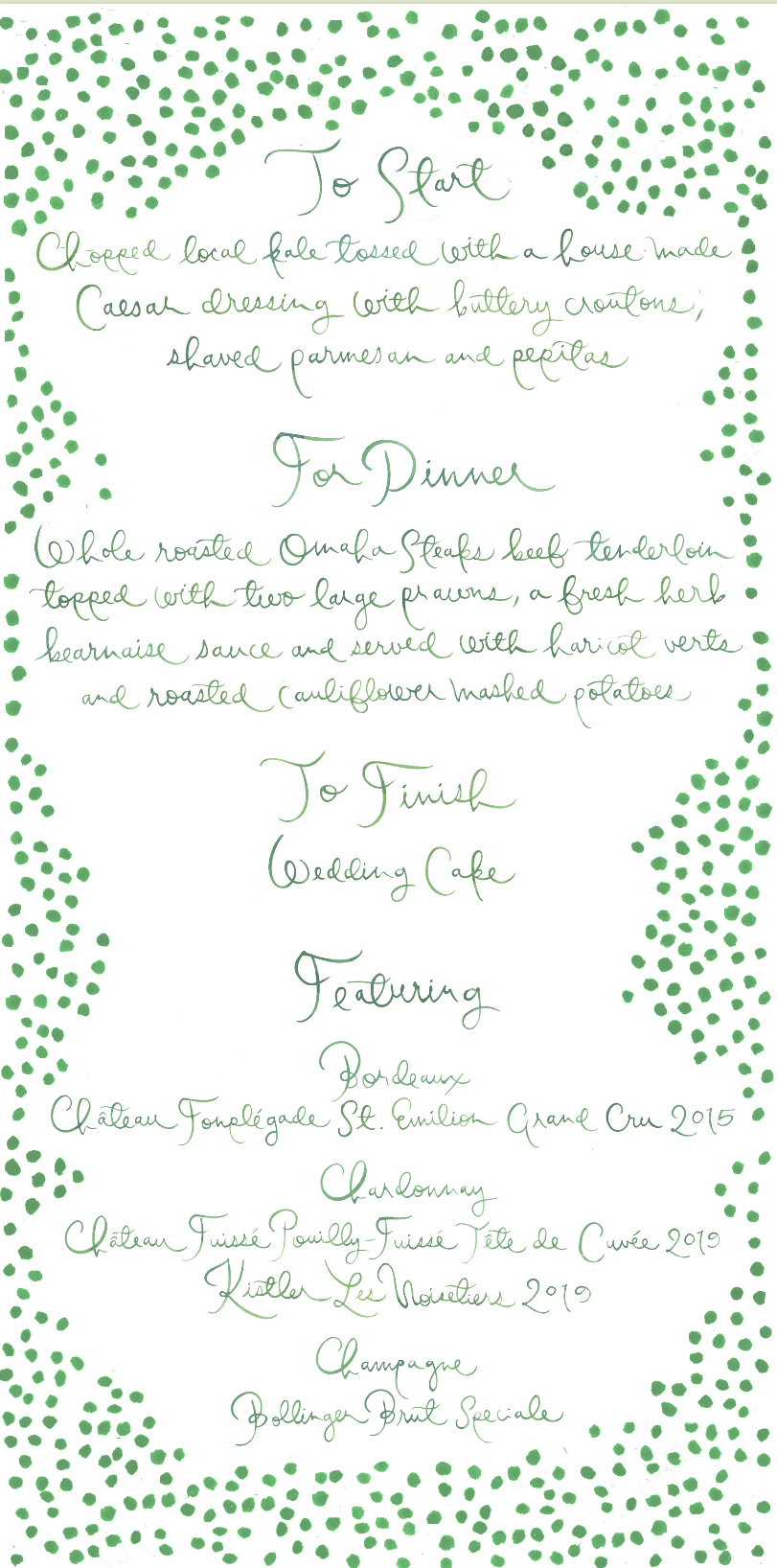
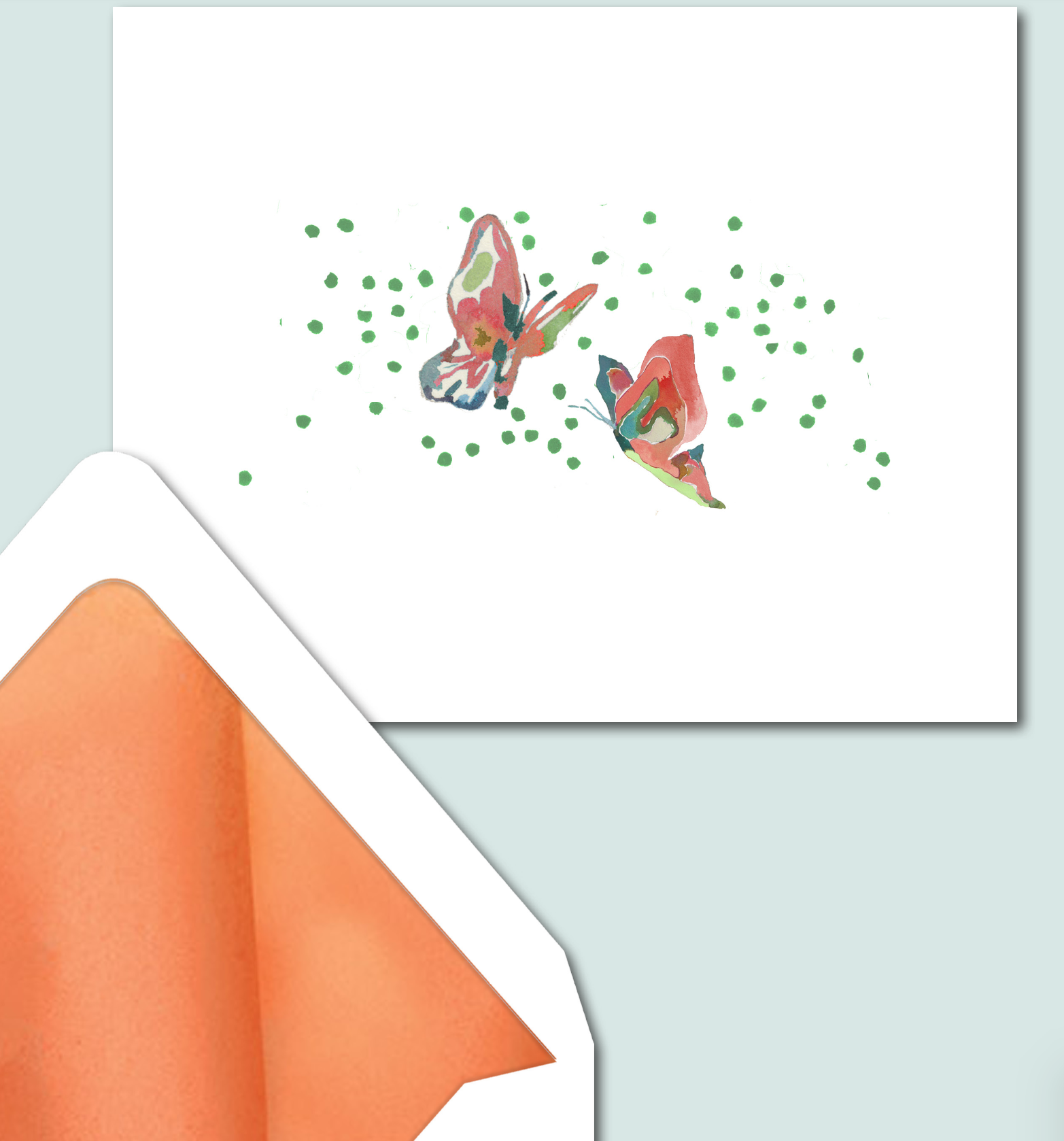
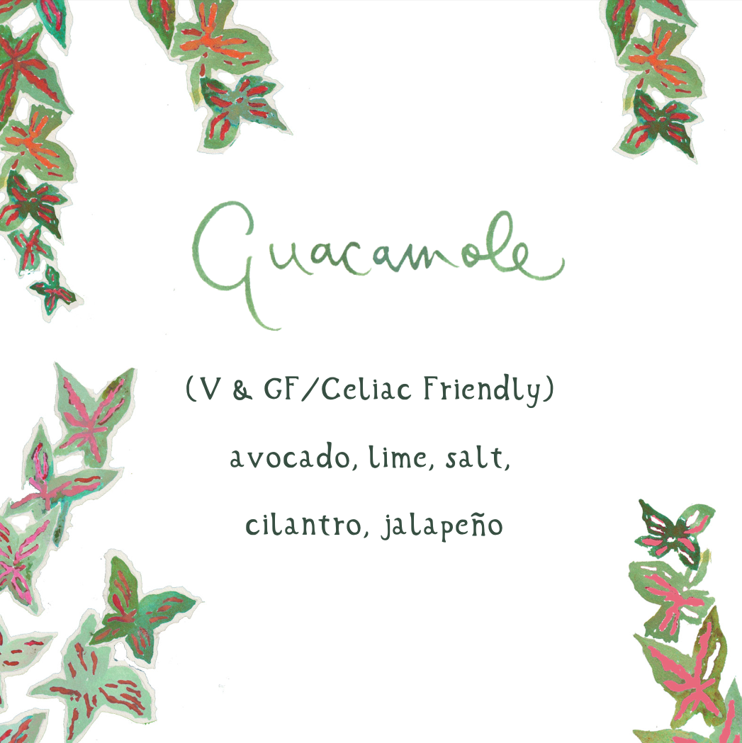
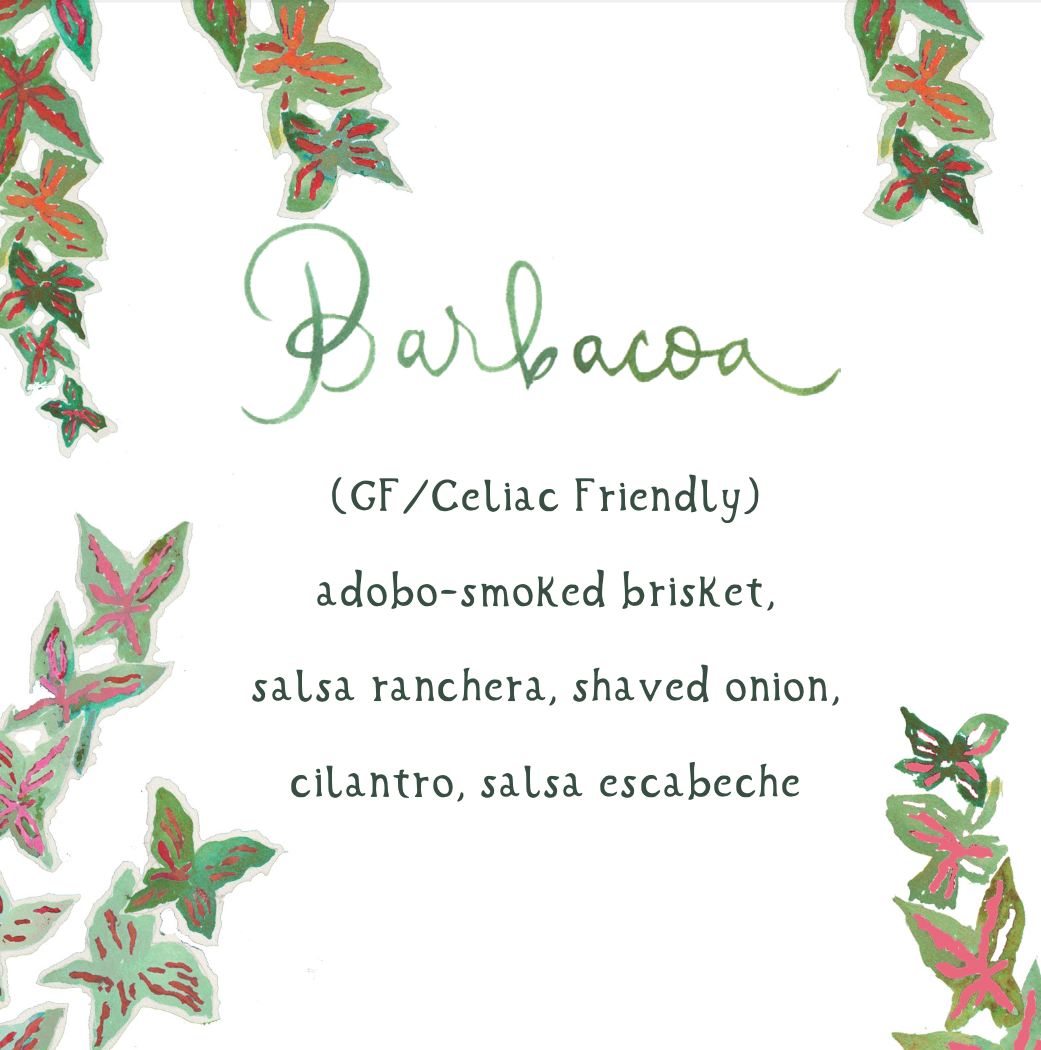
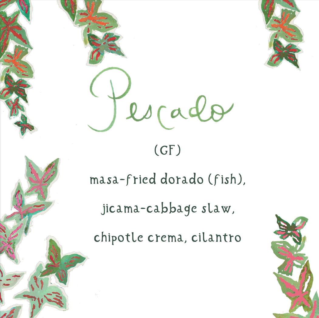
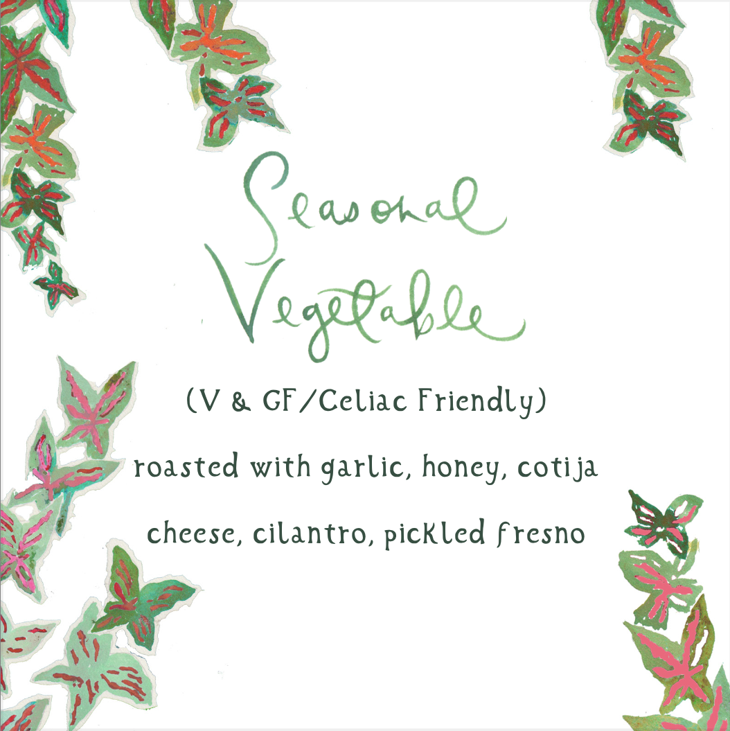
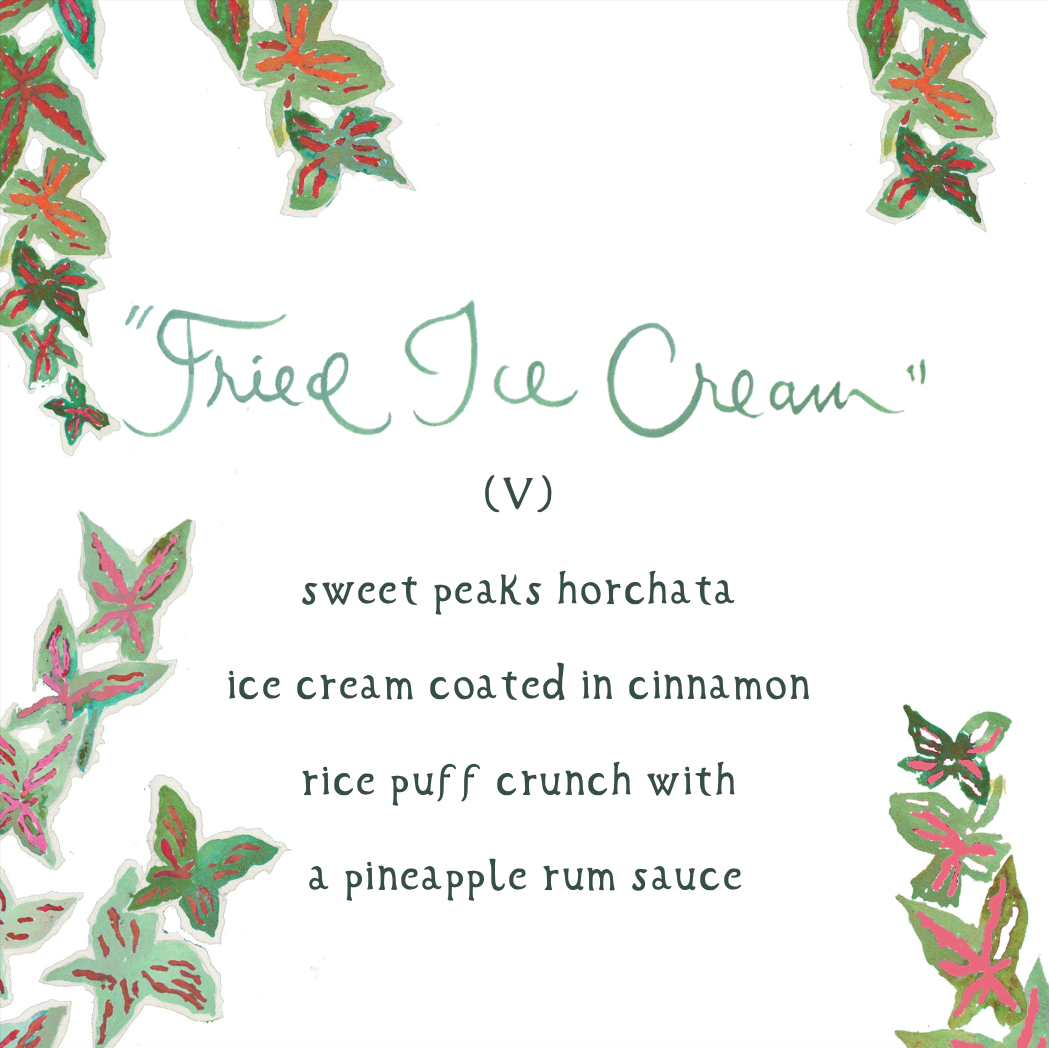
The menu was one of my favorite things. I wanted it to be large and in charge. I wanted it to be special. I envisioned a special shape or attaching a large tassel, but waited to see what Happy would come up with before being the controlling freak that I am. I’m glad I waited. This was it. I adored it. It was a thick, substantial 10” card. We could choose between front only with the name at the top and menu underneath, with dots surrounding, OR name on front with more dots, and menu on back.
I really liked the name on the front to be used as a place card, and we were in love with the butterflies and the green dots.
The meal was gluten free, and we also had a vegetarian menu that worked for most other food restrictions.
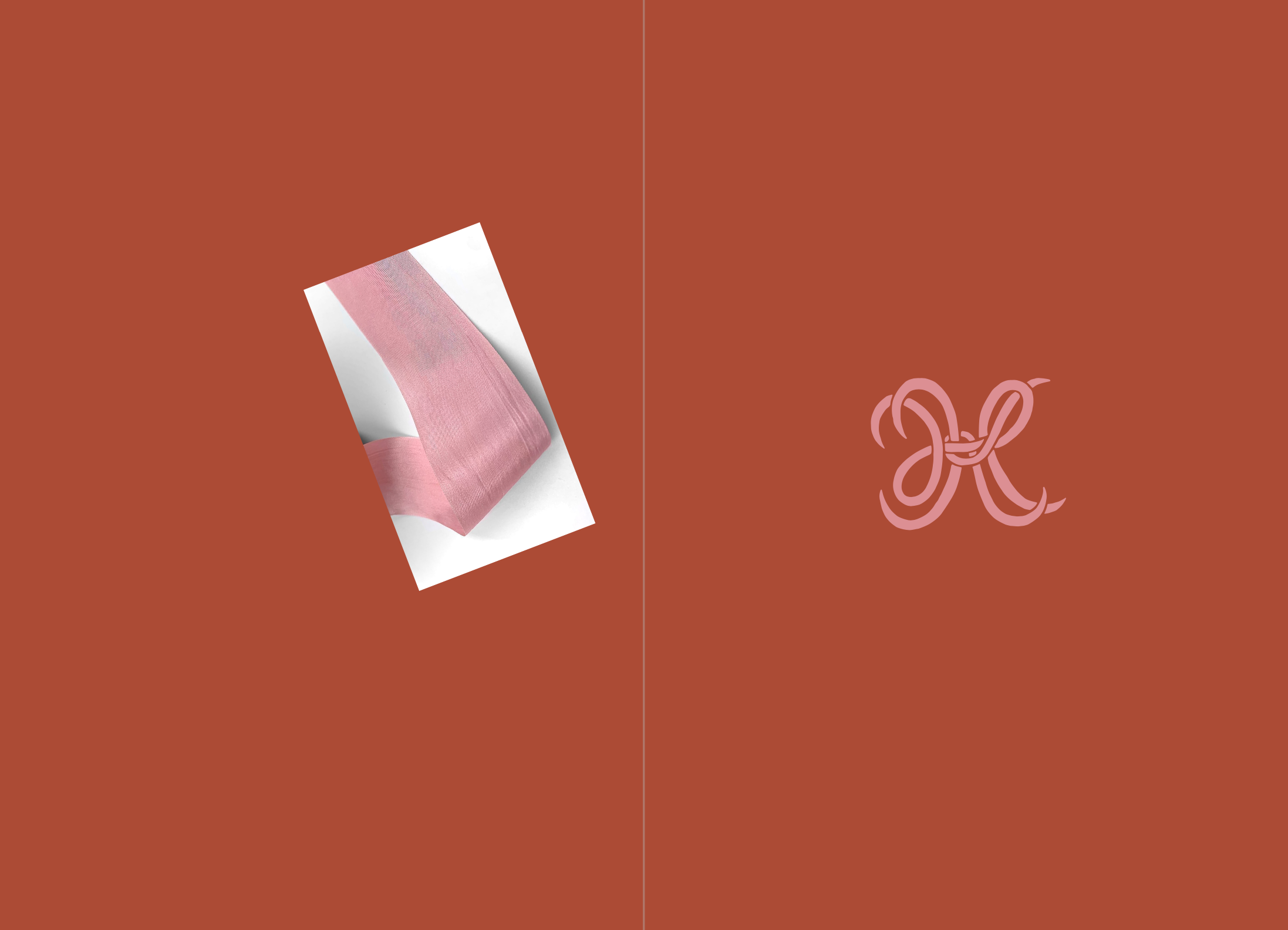
The welcome book was quite an undertaking. There is a separate questionnaire for that piece, and we included a lot of text, so we had to be prepared ahead of time with all that information. When I look back at the overview sketch now, the cover looks exactly like she had planned, but for some reason, when we received the email, it was a total surprise and I thought Happy was an artistic genius all over again. I just loved this piece. Obsessed with the pink monogram on the orange, and the pink silk ribbon.
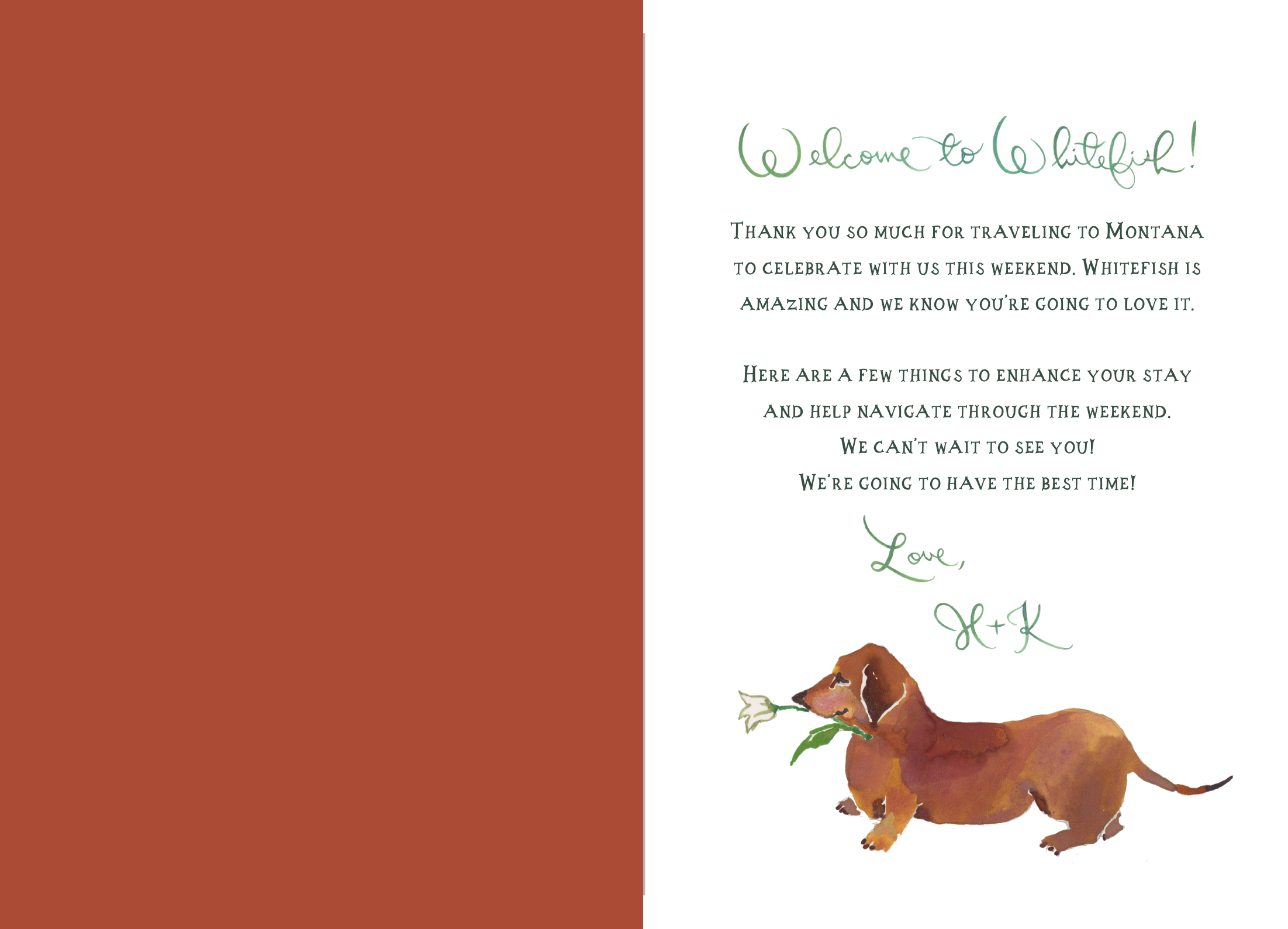
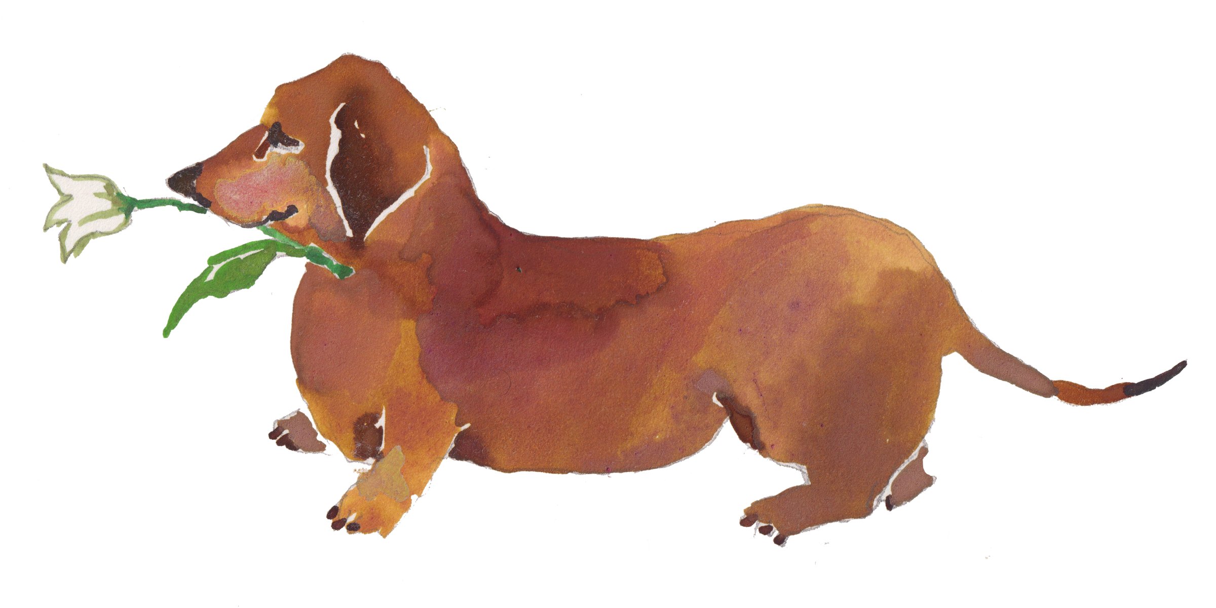
Ok first of all, Oscar on the welcome page about did us in. HE IS ADORABLE. I knew instantly I would be ordering notecards for Hillary!
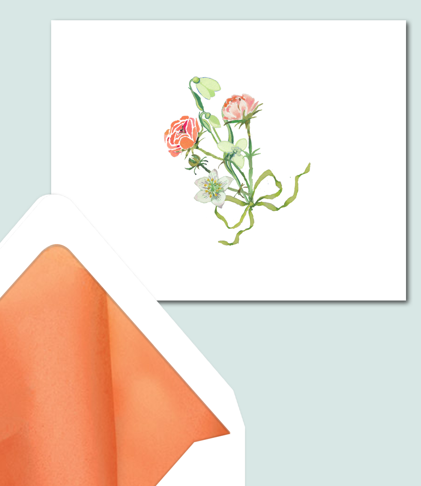
The deer and the flowers are stunning. I immediately planned Christmas cards with the deer! My florist friends would need notecards with the floral bouquet.
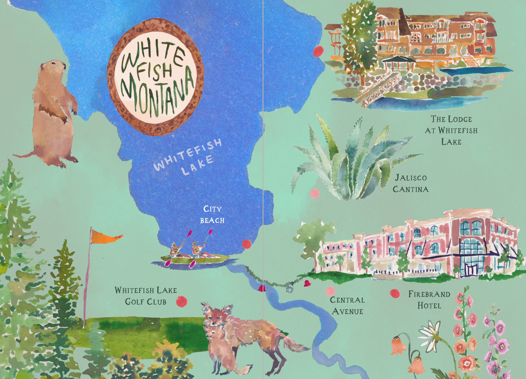
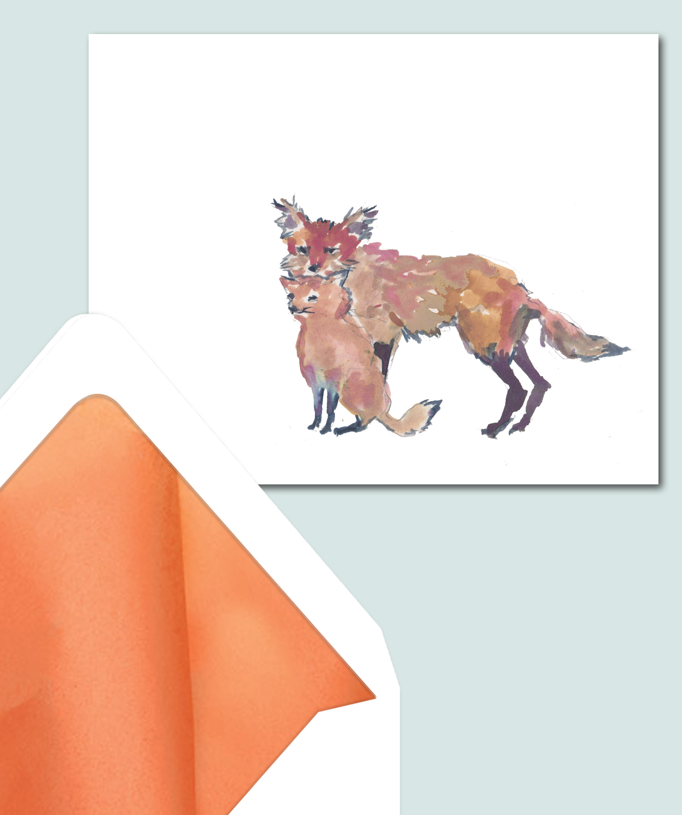
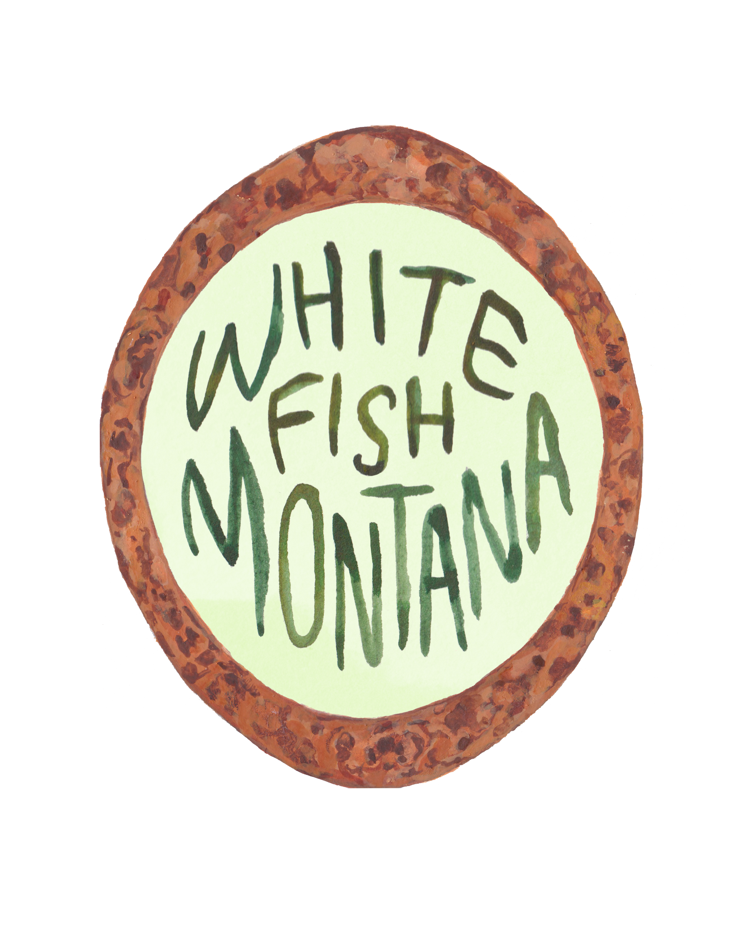
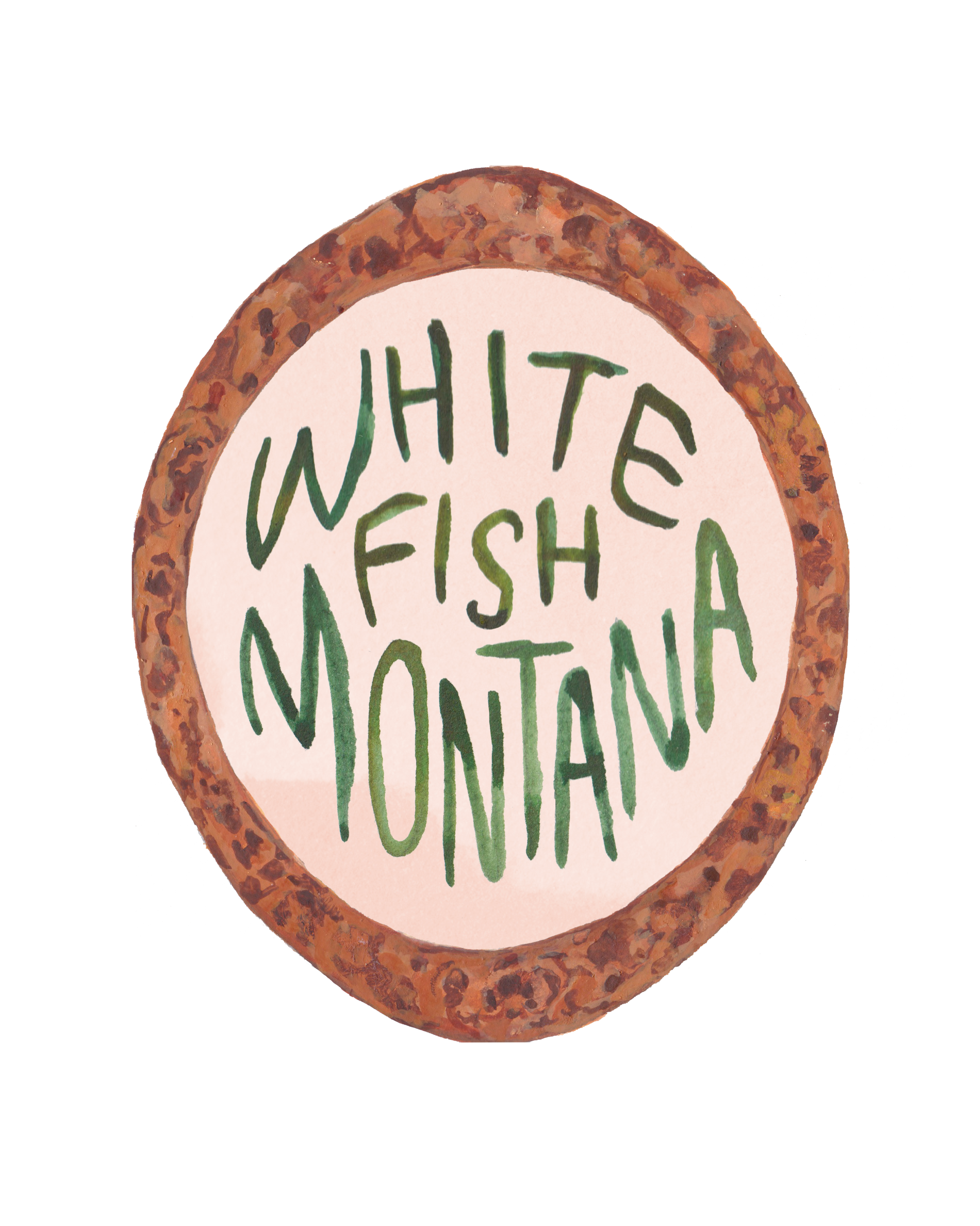
The Whitefish Lake painting is wow, but the map!! I mean we couldn’t get over it. The marmot would have to be used somewhere else. He was too cute. I had sent a photo of a fox family on instagram to Happy, and lo and behold there they were - right on the map! Also, the Whitefish oval was so good... that would have to appear elsewhere.
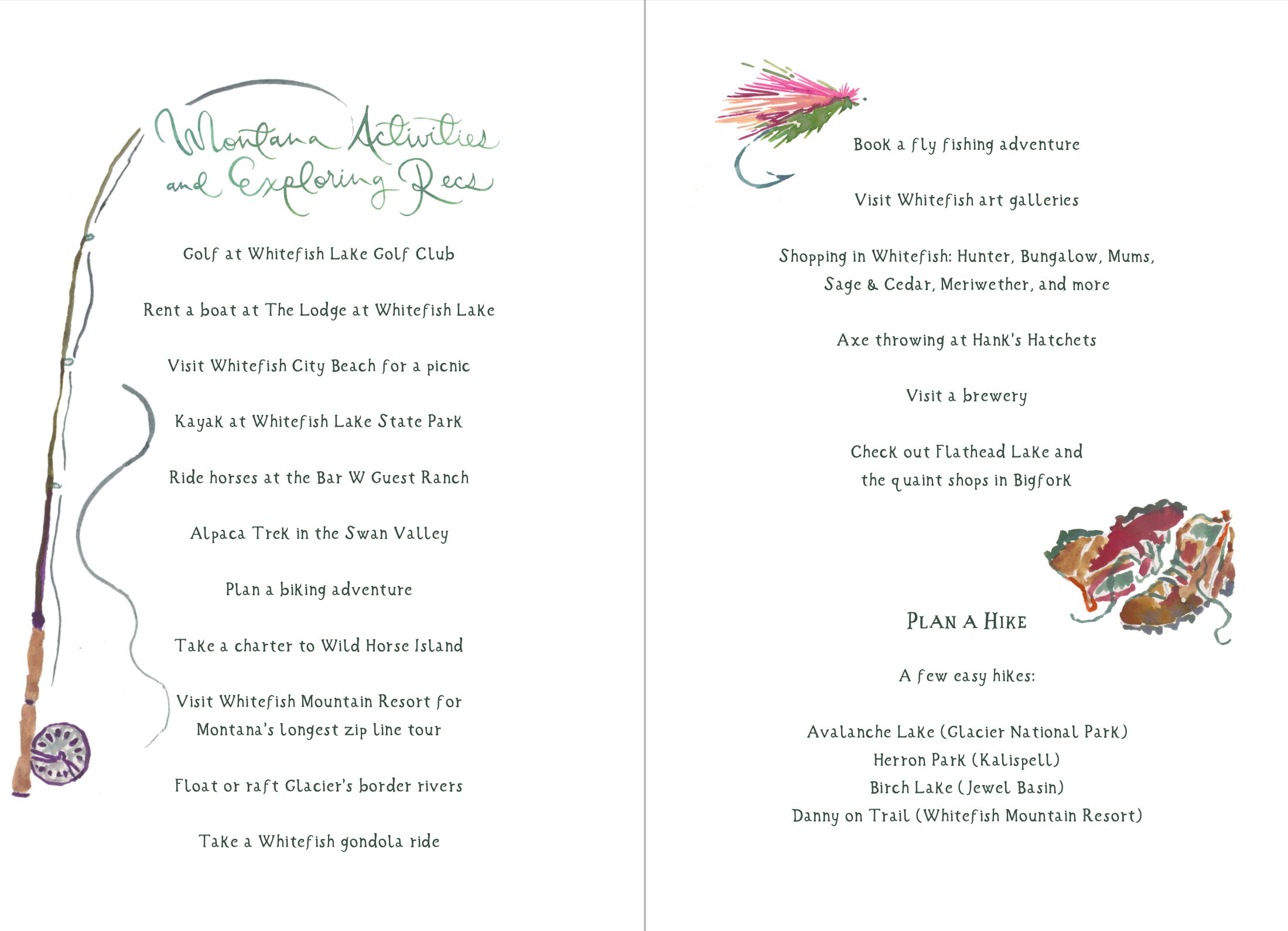
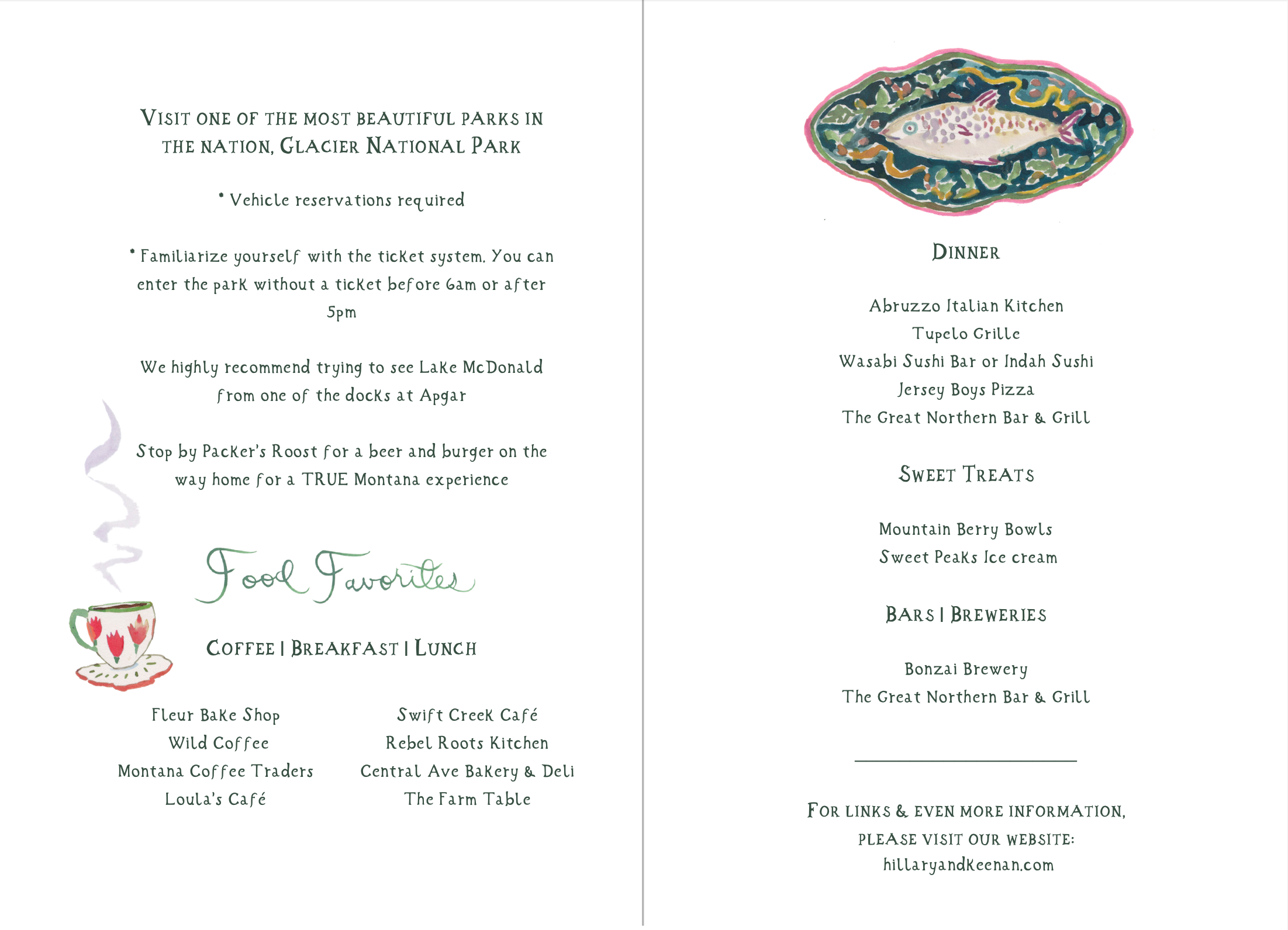
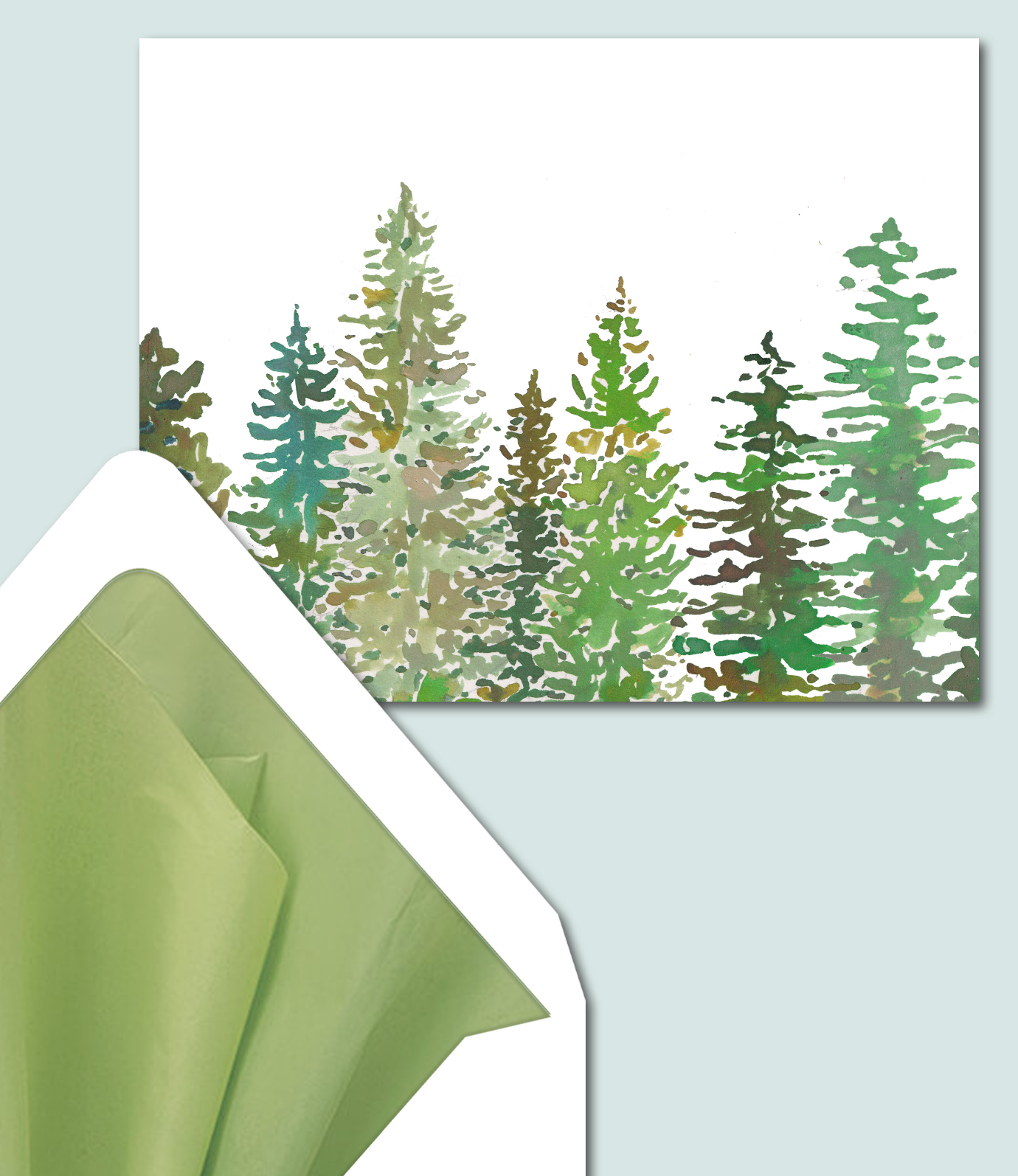
The fly fishing rod and fly, the hiking boots, the dinnerware and the gorgeous Montana trees!
This was the epitome of exceptional. I knew anyone opening this welcome book would feel special. Such a gift to elicit these feelings with artwork. I just can’t imagine this kind of talent as I’m not an artist, and I am in awe.
Annnd here come the additions!
We requested the marmot for the welcome bag tags.
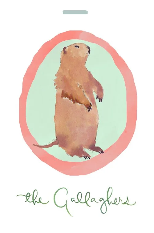
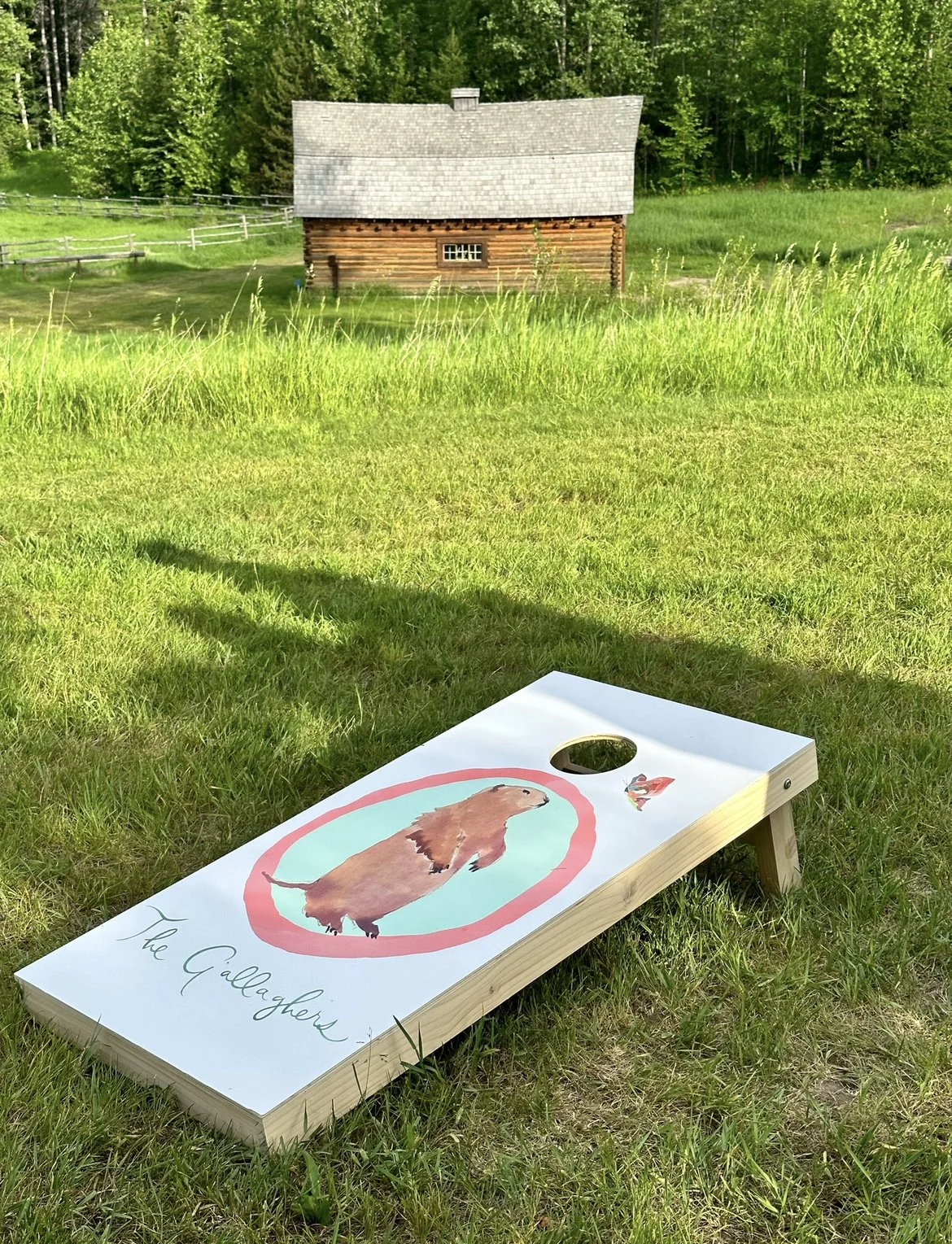
We also put the marmot on a cornhole game for the cocktail hour following the ceremony. (And a butterfly!)
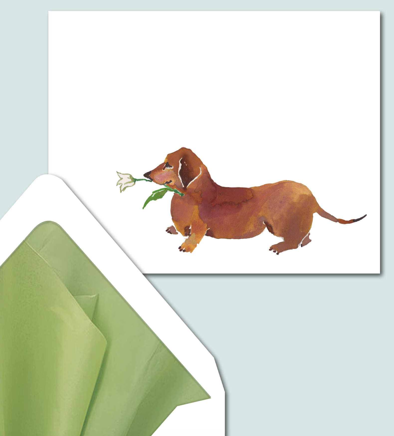
Then came the note cards. For Hillary, and for several special friends who were doing special things for the wedding weekend. I started with Oscar, then the butterflies from the menu, and I just kept adding! We ended up doing five designs.
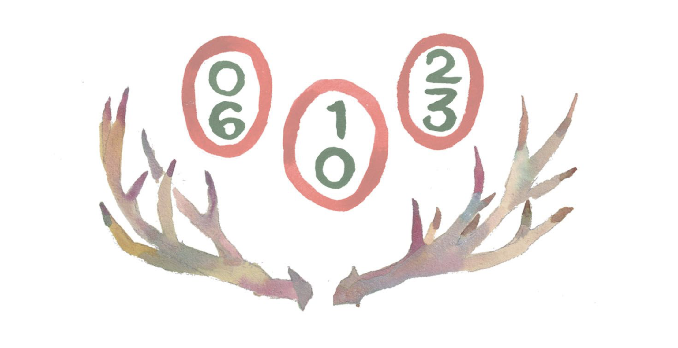
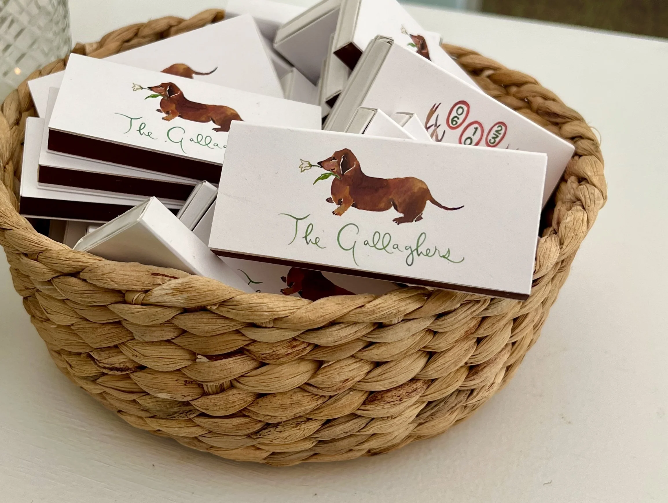
We also put Oscar on matchbooks with the antlers and oval dates on the back.
Just weeks before the wedding, Darci and Arden really engaged. Like I knew they knew what they were doing, so I was never worried, but the last month, they really kicked it into high gear.
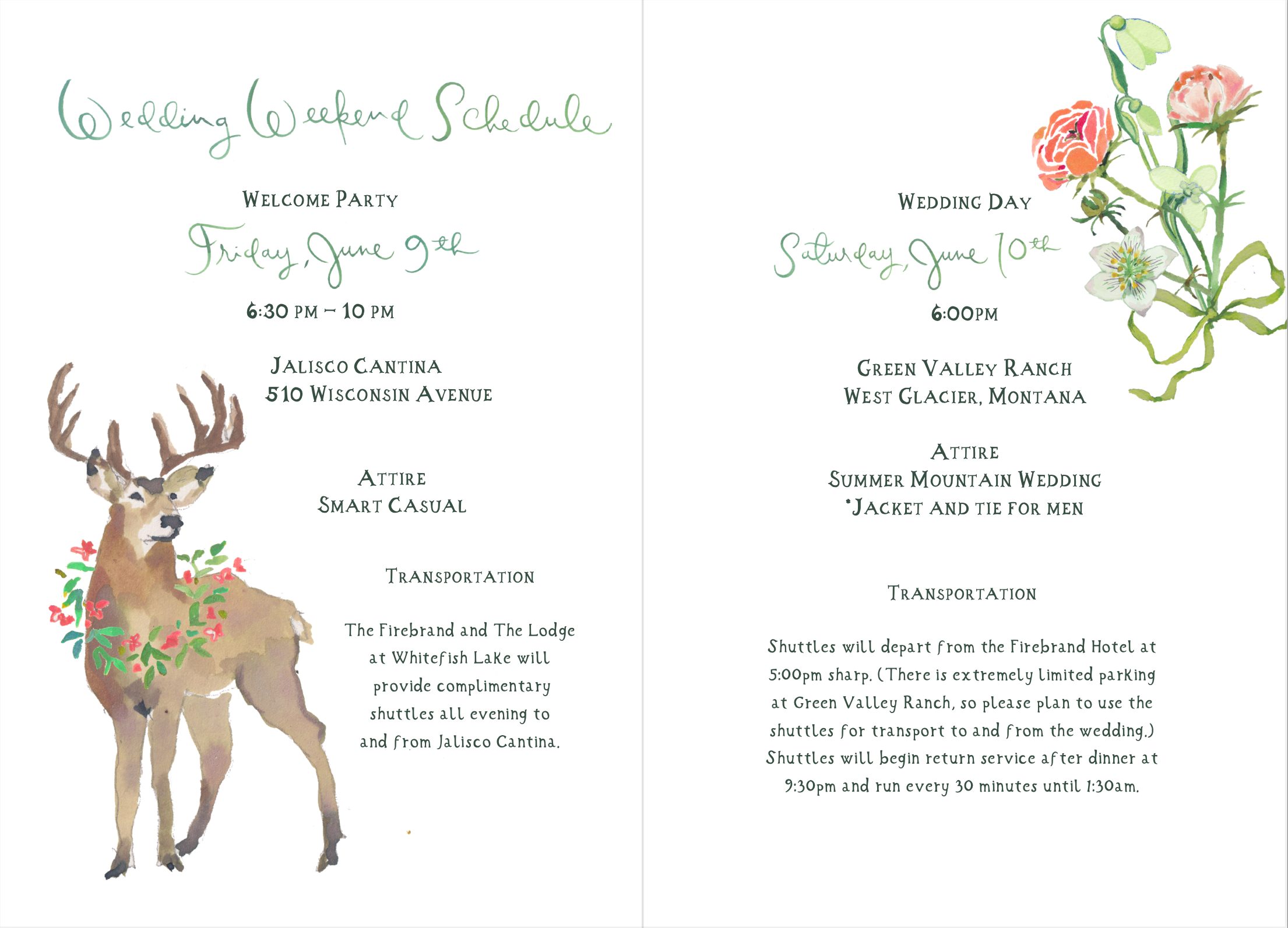
They suggested a few new pieces for the welcome party so everything would be copacetic and coordinating. We requested a sign for the hats for the welcome party, which I’ll tell you more about later, and it’s so fun!

Plus signature drink signs and food cards for all the offerings at the buffet. They brought back the crazy butterflies from the itinerary!
(There were 40 in all, but here are a few.)
The bar sign for the welcome party. . .
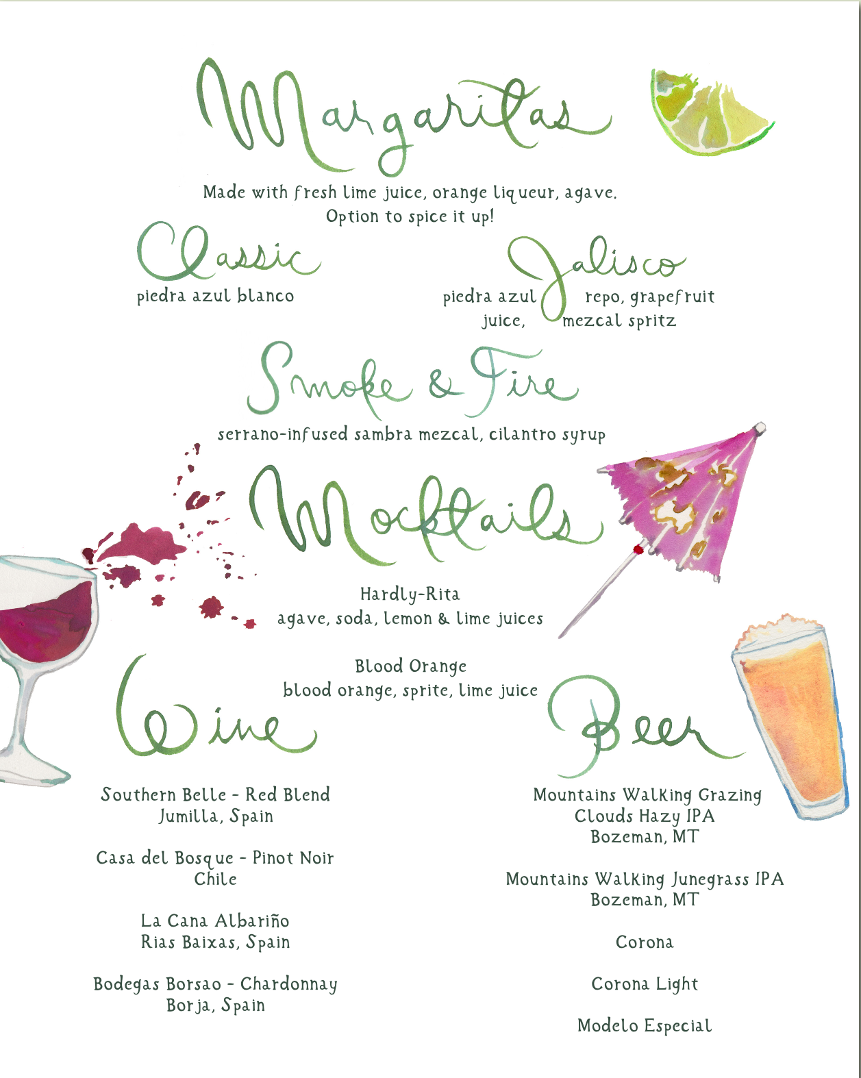
We also requested a drink sign for cocktail hour and the bars at the wedding reception.

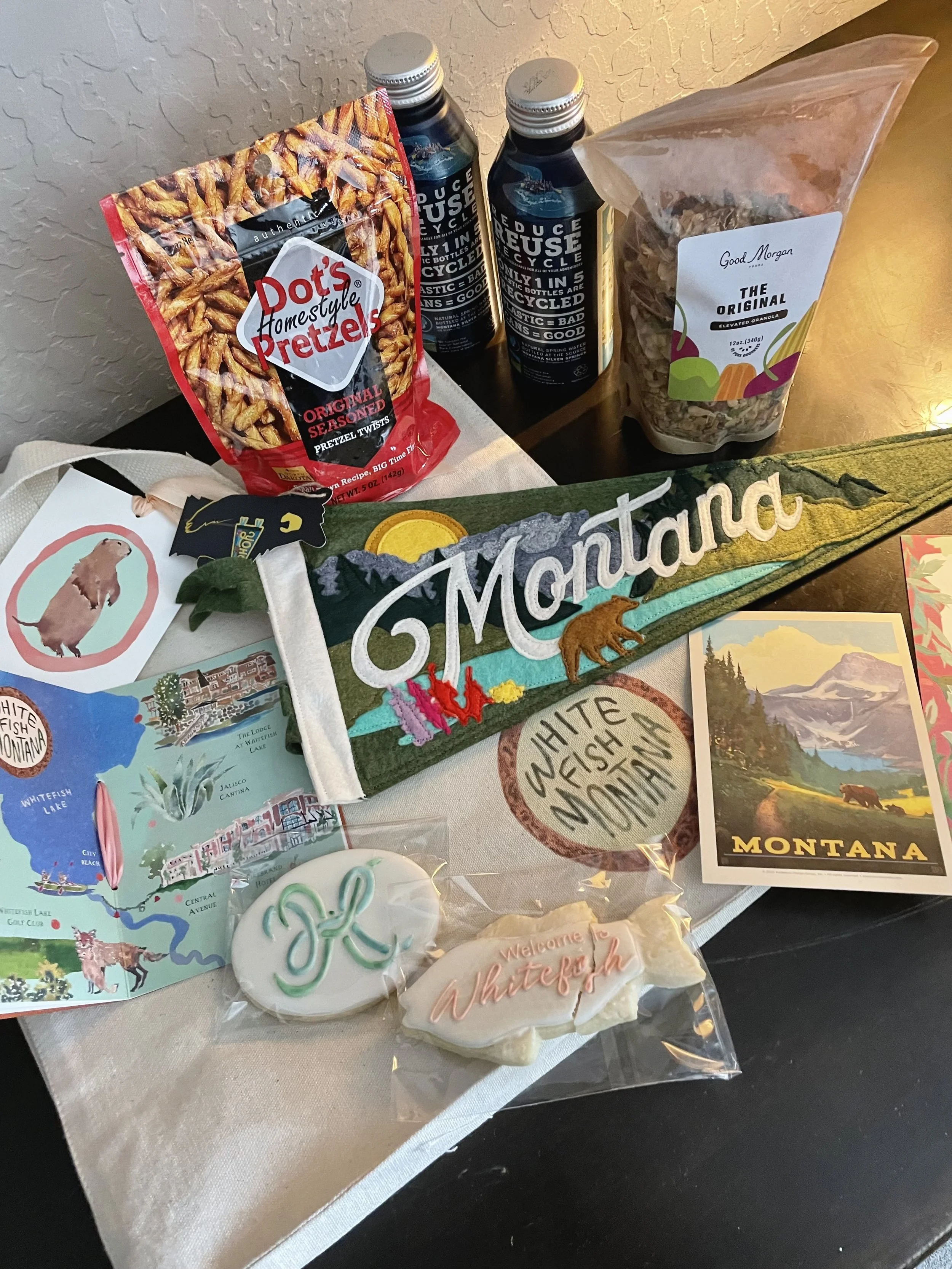
The welcome bags were so fun to put together! We found these pennants over a year ago and inquired about having some custom made. We think they are the cutest Montana pennants we’ve ever seen. They got us super excited about the welcome bags with plenty of time to plan. We also included the most delicious cookies of all time - one with the Happy HK monogram, and one fish shape cookie that said, Welcome to Whitefish. We added GNP waters in aluminum bottles, Dot’s pretzels, and the most delicious granola in the world. The last additions were a Montana postcard, a Whitefish map, and of course, the best part, the welcome book! All were tucked into the custom canvas tote and remember the cute Whitefish oval from Happy’s map in the welcome book? It was perfect for the welcome bag - in the bottom right corner!

We couldn’t decide between turquoise and green for the pennants, so we did half of each.

We couldn’t decide between light green or peach for the Whitefish ovals, so we did half of each.
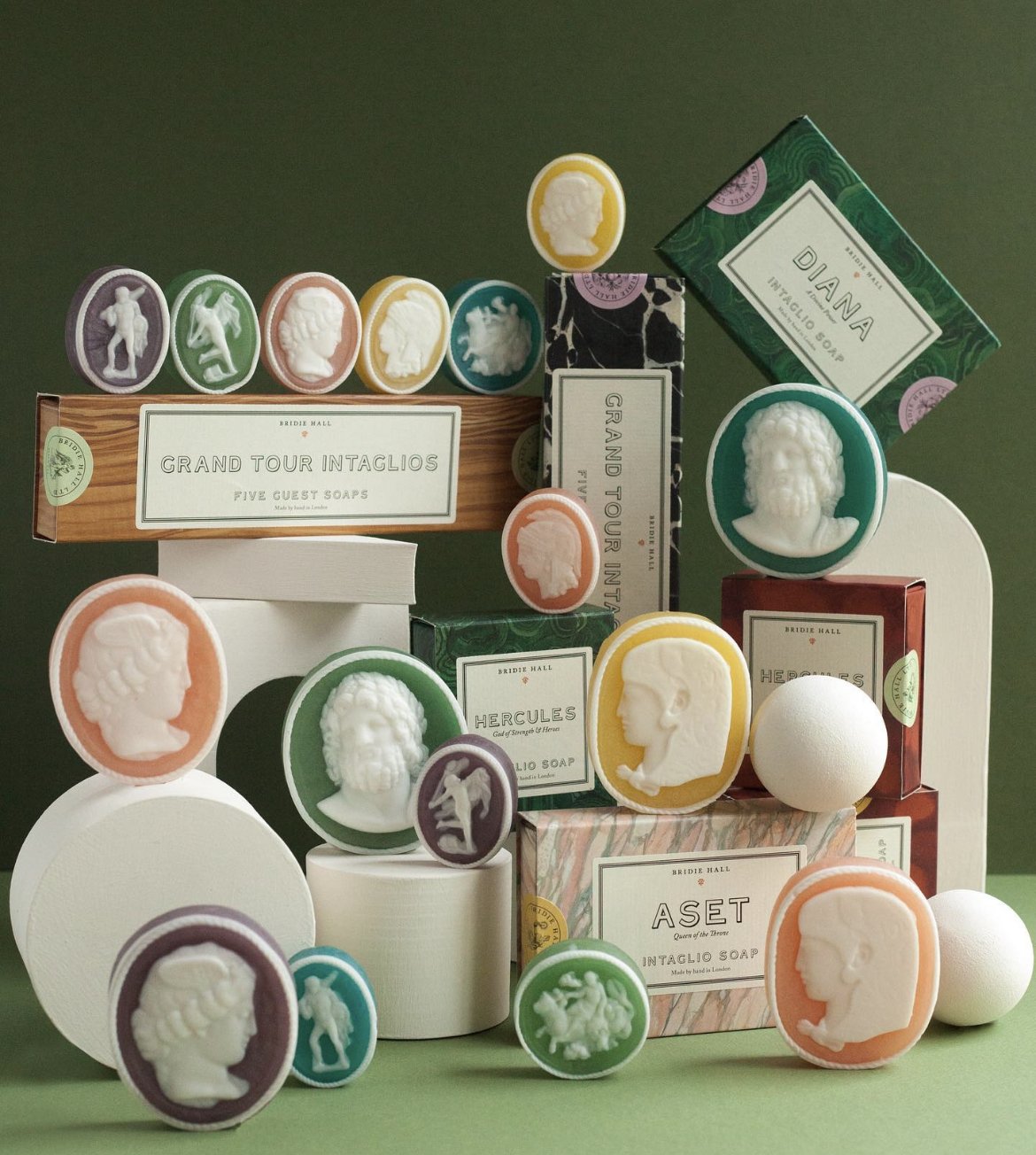
I found these darling oval intaglio soaps that I included in a few of the welcome bags for friends who were hostessing special events. (From Pentreath & Hall) I gasped when I saw them. I do love a theme!
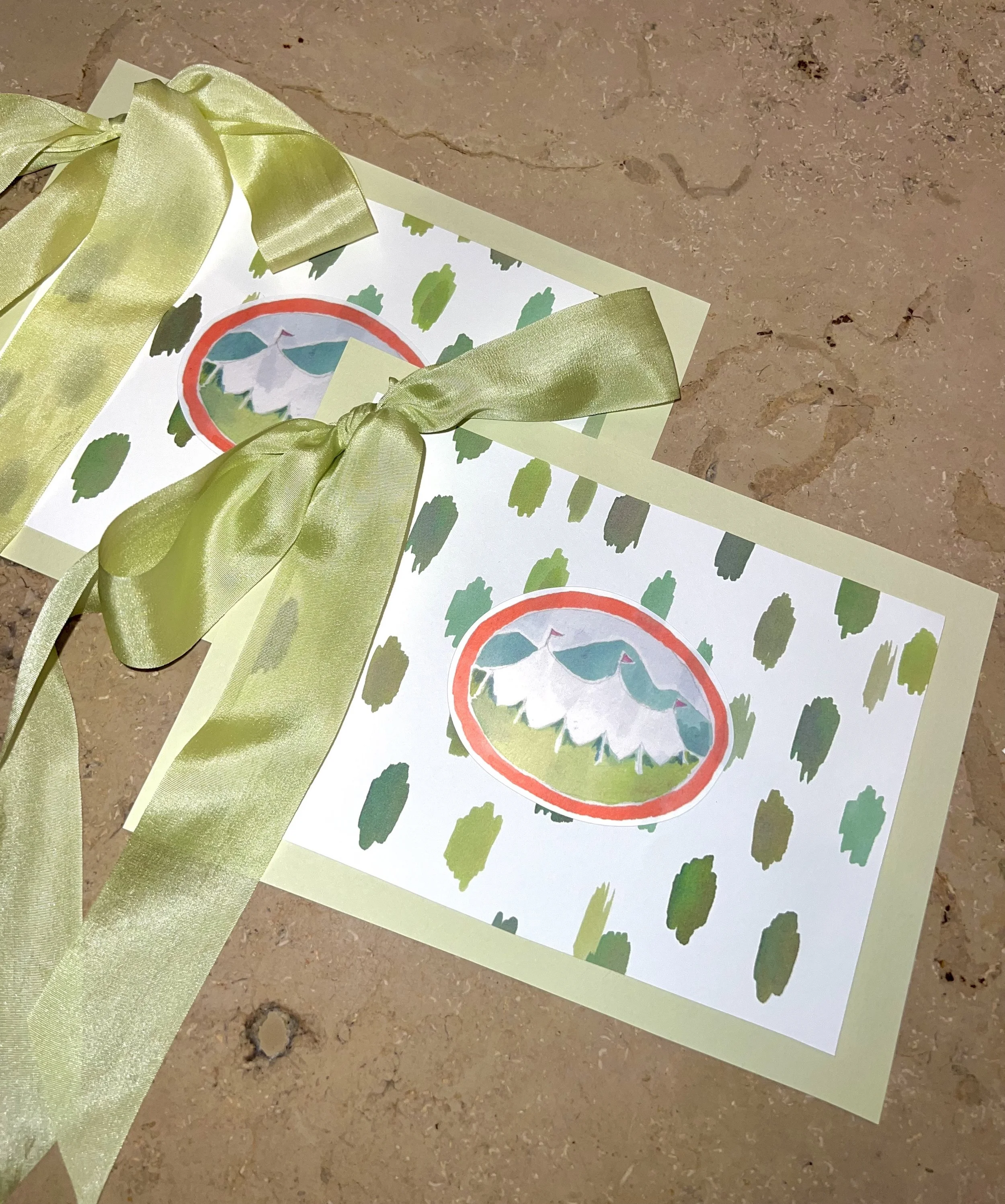
I’ll tell you one more thing I used Happy’s art for: a little art project, if you will. For months I worried about our speeches for the wedding. We both wanted to do brief remarks, just a basic welcome message, but we were both Nervous Nellie’s about it and neither of us enjoy public speaking. I knew we would want something to read from. I finally printed them out and doctored up these cute little speech cards using the pistachio envelopes, the spotted envelope liner, stickers I had made of the tent oval, and silk ribbon from the invitations. Can you tell I was a teacher?
Chip was opposed to the bows, but I insisted this is what should be done for a wedding. He believed me, so that was that!
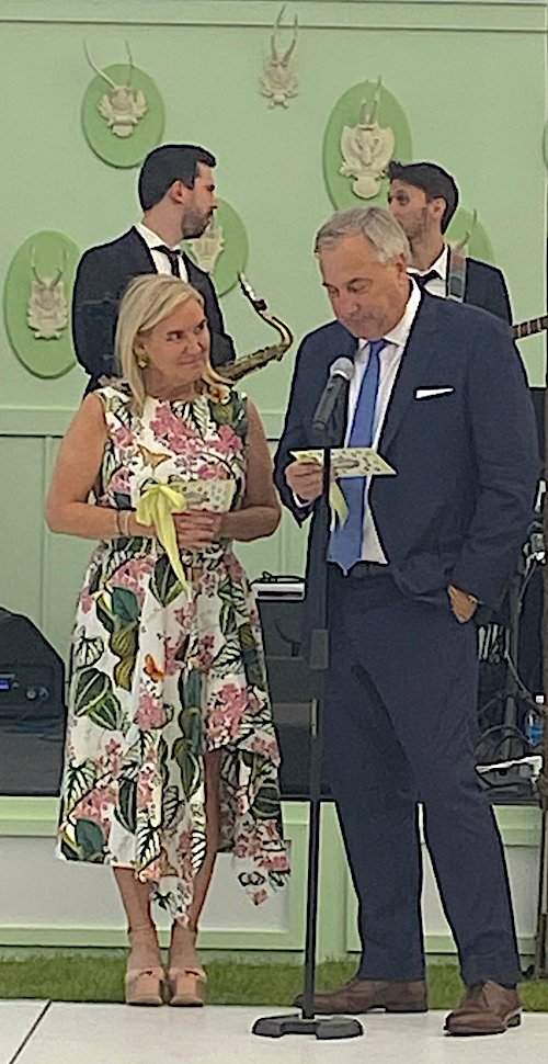
Here is a terrible photo of us with our homemade art project speech cards! With ribbons!
The stage backdrop with antlers on ovals in pistachio green was another fun favorite from the wedding decor. Will fill you in on all the good stuff in an upcoming post!
Happy Menocal’s artwork created some of the most special and charming parts of the wedding. For me, this was important. I’ve always loved stationery and appreciate the painted edges, the paper thickness, letterpress, and especially custom artwork. The amount of time and effort I spent analyzing the color of the liner, or the size of the menu card would seem silly (or straight up crazy) to most, but I enjoyed it so much.
I really hope I have the opportunity to work with Happy Menocal and her team again. I have ordered almost all of her stationery sets from her online shop, and several pieces from Julia B. I really want to use her Schumacher wallpaper some day! I’m a fan. Big fan. What a total and complete blast this project was!